Introducing The Heart Desires Store & Design Team!

Hello everyone!  It is spring and there is so much to celebrate!

Welcome to a doubly special event!

tonya2

Today we celebrate not only the Spring Coffee Lovers Hop, but also the opening of my friend Tonya’s store, The Heart Desires and our design team reveal!

I am so excited for Tonya as she embarks on this journey and I hope you will share in the excitement as well by hopping along with the design team and then hopping over to her store to find some sweet products for your planners and paper-crafting!  Tonya will be curating high-quality products that she recommends in a boutique-style shop.  For our hop, we are featuring some of her current products and/or Hero Arts company products.

For all you coffee lovers, she has some fabulous finds for your next coffee inspired project–stamps, stencils, inks, and great embellishments!  Here are few of my favorites.  Click any image My links aren’t working, so click here to be taken to Tonya’s shop to purchase:

Coffee Ring Stencil
One of my favorite stencils in my collection! The Crafters Workshop


Dress It Up Embellishments Button Fun Coffee Talk
These are new to me and I love them!  A good coffee embellishment can be hard to find!


Ombre Soft Brown to Cup O' Joe
Cup O’Joe Brown Ombre? Yes, please!!


Carpe Diem Word Label Stickers
I love Simple Stories for my scrapbooking; their word/phrase stickers are seriously the best, and you get so many for the price!


Coffee & Donuts
Can’t go wrong with Kelly Purkey for on-trend and witty fun supplies.
Tim Holtz Distress Watercolor Cardstock
This is my favorite watercolor and layering paper.  The texture and bright white are just perfect.  I have featured it below in my second card.


Ombre Neon Red to Purple
Hero Arts Neon Inks are my favorite for delightful, rich, retro neon.  A child of the 80’s, how could I not love them?

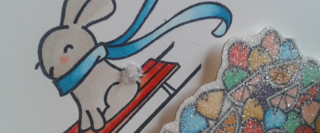
Today, I am featuring couple cards to celebrate Tonya’s store opening and the Spring Coffee Lovers Hop!

First up, my tropical twist on the coffee plant!

20160321_132400


coffea_arabica_botanical_drawing1

So here is a lovely picture of a coffee plant. In my modern twist, neon colors and bold black take center stage.  The flower and berry stem is from Julie Ebersole’s Wild Garden set.

The leafy stem has been cut from one of the most beautiful coffee bags I have ever seen (the coffee was pretty fine, too!).  I love single origin coffees and exploring small roasters.  We are pretty lucky here in the PNW to have some amazing roasters–Heart, Coava, Courier, Case Study, Seattle Coffee Works, Elm Roasters, and Slate to name a few.  In Seattle, we are also finally catching up with other progressive cities and our coffee shops are offering some wonderful roasters from all over the US.  Here is a photo of the actual bag: img_20160222_085111.jpg

Isn’t that lovely?  I have cut out the entire bag and have a few other up-cycled projects in the works!


20160321_130627


TECHNIQUE:
For the flower, I embossed a Hero Arts background stamp onto cardstock with clear Versafine embossing ink and covered it with clear embossing powder.

Then I sponged Hero Arts Neon pink ink over the embossing.  You can see some of the sheen of the clear embossing on top of the flower.

20160321_130731The sentiment is from an older Kelly Purkey collection.  She has partnered with Hero Arts and has some fantastic product for planners, scrapbooking, and card making which Tonya is featuring in her store.  Below are a few of the featured Hero Arts products (the whimsical leaf is actually from Penny Black, but I’ve had it so long, I thought it was a Hero Arts die!  Hence, its appearance alongside the other products!)

You can view more of my coffee-inspired projects here!


Next Up: Terrarium Love

Hero Arts offers up the best of the papercrafting trends like succulents and pineapples as of late!  My next card features HA succulent garden stamps, their terrarium die cut from Jen Hadfield gold paper and birch wood paper, Distress Ink watercoloring on Ranger watercolor paper, Studio Calico sentiment, and all digital papers from The Lilypad and The Digital Press.

img_20160320_183143.jpg

The inside washi is from Stampin’ Up, which Tonya also sells! I love the play of coral against the blues and ripe green.

20160320_182357

Okay, now it’s time for you to hop along to the rest of the design team’s pages for some more inspiration!

THE HEART DESIRES Design Team

Amy Tsuruta 

Kathryn Lorenzini  (You are here!)

Katie Brooks

Kimberly Wiener

Lenae Daly

Toni M Maddox

Tonya Jastad  Owner

GIVEAWAY!

the heart desires

But before you go, don’t forget to leave a comment because we will be randomly selecting a winner of a $10 gift certificate to The Heart Desires store.

The giveaway will run through Sunday night, 3/27, 11:59 pm pacific time for anyone who comments on this blog post. Winners will be announced on Monday night by 7pm Pacific time!

Thanks so much for stopping by!

Silver Beans: Coffee Lovers Holiday Blog Hop!

Silver beans, silver beans,
It’s Christmastime in Seattle…

Hear the beans grind,
See the brew drip,
This is Coffee’s big scene
And alongside this bustle you’ll see…

Coffee lovers, paper crafters,
it’s a holiday hop in the blogosphere,
Cut and paste, stamp and post,
Now sit back with your cup and savor!

Well, hello there coffee loving paper crafters!

I found very little time to craft in November, and with the renovation of my website, I had even less time to post anything new! So I am excited to be joining the festivities for the Coffee Lovers Holiday Blog Hop! If you missed the previous one back in September, you can check out my post here and the link to Chaitali’s blog!

Amy of Tsuruta Designs has taken the reins on this one and I am sure the participation will be just as outstanding.  I started this post last night, and from the looks of Amy’s site now, there are already over 150 participants so far!

Back in September, I received the new Prima Coffee Break papers, stamps and ephemera.  I was able to put some of the collection to use for World Card Making Day in this post.  Since then, I have received even more goodies that have been sitting pretty in their packages.  It was high time to tear into them and get to work on a holiday-inspired card for the coffee lover!

And here it is!

2014-12-09 10.20.22

It was a pretty simple construction; I really only labored over the additions of my silver beans and wax twine.

2014-12-09 10.27.16

The card features a 4.25 x 5.75 panel of the Prima paper, stamped with a holiday greeting from Tim Holtz’s Handwritten Holidays set  in Unicorn White.  The wooden coffee pot is also from the Prima collection.

2014-12-09 10.25.29

I just love my Impression Obsession coffee beans and mug!  The mug was given some dimension with a layer cut from foam.

I was worried the beans might be a visual distraction from the paper’s design and flow of the other elements, but I couldn’t resist.

2014-12-09 10.24.20

I cut the outer and inner snowy mounds from some thick glitter cardstock with Paper Smooches border dies and Stitches die.

Kelly Purkey provides the inside sentiment on my Peppermint candy stripe paper!  All has been adhered to Ellen Hutson’s divine Linen 110# Cardstock.

The hop is full of great sponsors with many generous stocking stuffers to be won!  You have until Friday, 12/12, to participate.

Details from Amy’s site:

  • Linky to remain open until Friday, December 12th @ 11:55 pm pacific.  Blog Hop participants (those that link up with a newly created holiday/winter coffee/other favorite holiday hot beverage project) are eligible for Sponsored prizes.
  • Hop ends on Sunday, December 14th @ 11:59 pm pacific.  Comments made before the end of the hop are eligible for the individual blog sponsored prizes.

I’m not planning to be a ghost of Christmas past as I’ve two other posts queued up for this week, so please stop by again soon!

May you feast your eyes on many a wondrous creation and may all your mugs be full this holiday season!


An Octopus’s Garden and a Summer Soundtrack

Adios, I’m a ghost!*

Bienvenue, I’m back! And with a backlog of work to boot!

But tonight, rather than bore you with the details of the last two months of my life, I am going to keep it simple and share one of my recently completed cards, which had been in the works for two months, as well some recently discovered music perfect for these sweet summer days, which for me have mostly been packed with work (and a few stolen moments of sun and fun), hence my longer than planned hiatus!

So one morning in what seems like a galaxy far, far away, we were driving along with the morning spring air flowing sweetly through the car and Ringo’s voice ringing out “I’d like to be, under the sea, in an octopus’s garden, with you.” And I immediately thought of my goofy little octopus stamp and all my sea creature dies and the shaker card craze, and before the song was nearly sung, a card was almost done… in my imagination, at least.

Until this weekend, when I was finally able to dive into a day of paper and stamp play!

undersea1

That little octopus from Kelly Purkey’s set just kills me!  I stamped him in a navy, embossed with clear powder and then stamped the coral from a fabulous Carta Bella set around him, wiping off the excess ink from his arms when the coral images had dried.

I flicked some Heidi Swapp Color Shine in Seafoam around him and then set to stamping the sentiment with Milo’s Alphabet and a Stampendous set.

2014-07-12 16.22.29

What to do with all that packaging you accrue from crafting supplies?

Repurpose!

The plastic shaker window is from the packaging for a set of die cuts!  It was easy to find rectangle dies large enough to cover its edges. I used Spellbinders and Mama Elephant to cut my wave paper and create a frame.

2014-07-12 19.56.40

Sequins, Melissa Frances Sea Glass, sparkly Memory Box and Savvy sea creature die cuts fill the floor of my scene.

2014-07-12 16.23.45

Since I’ve been away for so long, I never did share the fact that I was one of two winners in the Basic Grey Grand Bazaar give-away!  My goodies arrived at the end of May, and I just cut into the first sheet of paper from the set for the blue background paper on this card!  I NEVER win anything, so seeing my name randomly chosen for this collection that I love was astounding!

Here are some photos I snapped of the stash!

2014-06-11 19.57.55 2014-06-11 19.59.19

So before I go, allow me share some sweet music with you!  Summer is the perfect time to just lounge long in the morning sun or sit through the evening dusk listening to some down-tempo, chilled out music!  This ended up being quite a musical weekend for me– a local street fair brought me back to a fabulous local group The Moondoggies (*from whose 2013 album I have stolen the first line of this post).

And after hearing the song “Baby” by Donnie and Joe Emerson on NPR’s Dinner Party Download while I was making the card above, I found myself traveling down a rabbit hole into some fascinating musical terrain–one story, one song lead to another and another!  The tale of Donnie and Joe is interesting–their rediscovery nearly 35 years later even more so– and their 1979 album is super fine for a lazy summer Sunday.  The track “Baby” has garnered the most attention.

Ariel Pink, also new to me, released a cover of the song that captures its essence perfectly.  Gorgeous soul groove… YouTube has a mix based on Ariel Pink’s track that is wonderfully lush listening.

Like this tune from Darondo…

And this cover by Chet Faker (loving his work so far)…

Need to take it up a notch?  Here’s some pure weirdness, In the Summertime, by Mungo Jerry

And if you are still with me, well, how can I leave without sharing this…

Happy summer, happy listening, happy crafting!


A Crafty Day and A Clipboard Card

And another weekend draws to a close!  Did you find yourself inspired and productive?  I know I did– and now, not only do I have a product pile-up, but I also have a post pile-up!

But before I get to my card and muses, I must share a bit about my crafty Saturday gathering!  I am not only lucky to live in one of the most gorgeous places in the United States, the Pacific Northwest, but also lucky to live in proximity to some of the nicest and most talented card artists out there, all of whom are likely household names to many of you! One of the most wonderful aspects of this creative journey beyond the act of creating is the people I have met online across states and continents through challenges and blogs.  Being able to meet some of these online friends in person makes it even more wonderful.

So yesterday I had the pleasure of laughing, eating and creating with Katie Brooks of KB Stamps, the Kimberly Wiener of Wienerhoneymooners, Amy Tsuruta of Tsuruta Designs, and Amy’s friend, Laurel.  I didn’t get much card making accomplished, but had a great time sharing supplies and ideas, while accomplishing a lot of die cutting (what else is new lately?!) for a mini album!

Amy was a wonderful hostess, and I wanted to show my thanks not only for opening her home to us, but also for being so supportive in her commenting over the past months since I have become more active in the community.  It is amazing how she makes the time to visit so many blogs and comment on people’s work (in addition to creating, being on numerous design teams, raising kids and working!)  Since Amy loves coffee, I knew I had to bring her a little hostess gift of beans, and of course a coffee-themed card!

I have been working on what I will call “clipboard cards” from recycled cardboard and corrugate.  I am really excited about these! There are so many possibilities for different occasions and aesthetic approaches with these cards.  I plan to complete a tutorial for you once I have some others finished.

Additionally, I’ve been experimenting with different card-making styles to challenge myself, but the one I keep gravitating to is the shabby chic/vintage collage style with a modern and/or mixed media twist as seen in the work of Magda Luczak of Mama Judo, Stephanie Schutze of Scrapmanufaktur, Frau Muller, and the older work of Scrapperia, whose recent work is more modern, on-trend, freestyle collage.

These works in particular influenced my thinking, since I have been thinking about these a lot!

Stephanie Schutze, Scrapmanufaktur
Frau Muller
Frau Muller
Scrapperia
Scrapperia
SONY DSC
Mama Judo


I actually had set out to CASE Magda’s tag card, but went in a completely different direction after playing around with my elements. She has another fabulous tag card over at her blog which I am thinking of CASE-ing.  Her work is just magnificent!

So here is my card!

2014-04-25 18.22.32

2014-04-25 18.23.46

2014-04-25 18.24.09


THE PROCESS:

I measured and cut my clipboard back out of recycled cardboard; I use a lot of legal pads in teaching, and always have the cardboard left over after the pad is used.  Great crafting supply!  I did the same with the corrugated paper, rounded the edges of each, and then Mod Podged them together.

I then distressed my top panel and stamped my coffeestains in Versafine Onyx Black, using stamping off to get variations in hues.

I distressed some scrap paper, and then die cut my little coffee mugs.  I strung them along the hemp twine and finally was able to put my Tiny Attacher to use!  Love those little staples!!

I knew immediately that I had to use Kelly Purkey’s stamp from the I Like You set– which I thought was cute in reference to a cup of coffee!  I stamped that in Memento’s Rich Cocoa onto my tag cut from Avery Elle’s Tag set.  I did not attach the tag to the twine as I wanted it to slip out so the message on the back could be read.  I also like the coffee cups sliding freely along the twine.

2014-04-25 18.26.36

I set out to layer a bit with various papers and the burlap, distressing my 7 Gypsies Conservatory paper with the Tonic Distressing tool.

I die cut the tab from My Creative Time’s Stitched File Tab, and specifically chose a section of the washi to tear and affix to the it.

Then I clipped it all together with the tiny binder clip.

2014-04-25 18.24.51

But wait, there’s a surprise inside!!

2014-04-25 18.27.55

2014-04-25 18.30.59

Some fun confetti mugs and Paper Smooches “Thanks” die cut from various papers and wood veneer.  It’s not a confetti pack without some trendy sequins!  Love those Studio Calico woodgrain ones!  I snuck the vellum envelope between the layers.  You can see it peeking out in photos above.

2014-04-26 08.04.39

The bottom initially looked a little bare one assembled, so I die cut some branches from the Penny Black Nature’s Song die.  I wrote out a message on the back of the tag and then wrapped it all up with some rough twine!

2014-04-26 08.04.11

After our fabulous day together, I headed to Snoqualmie Falls, not far from Amy’s for a nature walk.  Here are some of my pictures!  I so love our PNW forests with the knobby tree-covered trees and mossed branches bending and hanging and breathing life into the forest!

And the neon azaleas are popping out all over now making my eyes pop right out of their sockets.  I could look at them in their varying hues of fuschia, red, and pink for hours!

2014-04-26 14.50.422014-04-26 15.22.112014-04-26 15.34.01

Well, in three minutes, the weekend will be officially over, and it is way past my bedtime.  Instead of popping out, my eyes are about to roll back into their sleepy sockets.  So I won’t be leaving a fancy linked up supplies list this time, but I have listed what went into the card.

This is headed over to CASE Study for the design team call.  There will be a new guest designer as well as a new Muse this coming week! Check it out!

And now it’s lights out for me!

xo

SUPPLIES:

Kelly Purkey “I Like You” Stamps
Prima Paper: Sunrise/Sunset
Crate Paper DIY Shop
7 Gypsies Conservatory Paper
DCWV Burlap Paper
DCWV Woven Paper
Recycled Cardboard
Corrugated Paper
Hemp Twine
Memory Box Mini Cups
Penny Black Nature Song Die
My Creative Time Stitched Tab Die
Avery Elle Tag Die
Tim Holtz Tiny Attacher
Tim Holtz small binder clip
Tonic Paper Distresser
Distress Inks: Walnut Stain, Antique Paper, Tattered Rose, Tea Stain
Versafine Onyx Black ink
Coffeestain Stamp is from Inkadinkado (I think!)
Studio Calico Woodgrain Sequins

Expectations and Aspirations

For the past month, I have been delving into Dickens’ Great Expectations with one of my students.  As a teacher and student of literature, I have read my share of ol’ Charles, but never this tome.  It would be easy to get lost here in the mists and marshes of my own ideas about the novel, but I will spare you all but one thought since I’ve got some cards waiting patiently in the wings!

As I prepared my lesson on aspects of irony in the novel (not the least of which being the title!), I got to thinking about the difference between expectation and aspiration.  Expectation connotes a sense of certainty, deservedness, and righteousness. It is a passive act; expecting is waiting, or literally a “looking out for” (“spectare,” from Latin, meaning to look). In the novel, the characters’ expectations and consequent attachments to particular beliefs lead them to not only make poor decisions, but also cause them deep unhappiness. The greater the expectation, the greater the devastation!  Poor Pip!

On the other hand, aspiration, which literally means to breathe in, carries with it a more positive, and active connotation.  The Latin root “spirare” (to breathe) is related to “spiritus” or spirit.  When one aspires, one strives or breathes toward a higher purpose.  The goal or desire will not simply be had just by waiting or thinking it will be so. There is work, life force, flow and action involved!

So how does this all relate to this week’s final CASE Study design?  I approached my card with an image in my mind and an expectation that it would manifest as perfectly as I’d perceived it. I had my own great expectations for this piece.

And as a result, I experienced a deeply unsatisfying and frustrating session when I attempted to make my vision a reality.  There was no breath, and no flow.  And then there was very little time to revise.

So there my card lay as I contemplated expectation and aspiration and hyperventilation, and prepared for my student’s lesson that afternoon.

You know what they say about the best laid plans of mice and men…(Okay, okay get back on the shelf Steinbeck!)

It took until yesterday for me to be able to see the card with new eyes, rip it apart, start again, and then find something still missing after I had taken and edited all my photos for submission!  What a comedy of errors!  I was dreadfully afraid of how the image would represent over at CASE since I captured it at night under the garish glow of an overhead light!  Happily, it doesn’t look as horrible as I’d expected.  (There’s those darn expectations again!)

Joni’s Card

While I loved all of our muse Joni’s cards, this one particularly struck me in its ethereal beauty.  That breathy pink!  The layered vellum!  I remember seeing it on her site when she first posted it and I was immediately drawn to it.  Let’s take a look!

CSC184

And here is the final incarnation of my card!

2014-03-26 10.46.55


I knew I wanted to follow lines of Jodi’s card, and originally envisioned the city as the centering point, with vellum and cardstock umbrellas dancing beneath just as her leaves are doing below the sentiment on her card.

However, hard as I tried, those umbrellas just wouldn’t work.  They seemed to overpower or compete with the city.  There was just no flow!  I won’t even get into how I ruined the top of that nearly completed card by smudging black ink on it.  Then I cut it too short and it was really all over then baby blue.

TIP: Make sure to ALWAYS heat set your pigment and Versafine oil-based inks!! Even if you think they have dried after 30 minutes!!!!

2014-03-26 10.56.30


I recently purchased some PTI vellum cardstock and gorgeous turquoise and silver vellum at Impress Stamps. I wanted to capture the airy feel that the vellum conveys, and so in my final incarnation, I laid a panel of the turquoise down and tried a couple of my “cloud” scraps (left over from the Avery Elle Love Notes pockets I made last week, seen here).  That seemed to work.

But when I returned to my card and saw it in pictures, it just felt off.  I kept wanting a black and white stripe along the bottom of the city, but none of my washi looked right.

So it was, at long last (11pm to be exact), the addition of baker’s twine that tied it all together (pun intended!).

CASE Close Up

Another aspect of the card that was inspired by Joni’s is the subtle, airy sparkle of my stenciled raindrops (really they represent the tears I shed and the HELL-o this card gave me! 🙂 )

I used Kelly Purkey’s stencil, Heidi Swapp’s Color Shine in White., and some masking to achieve the background.

All papers are from Bazzill– that gorgeous texture of the grey, like stone, and the crosshatched orange–delightful!

The back and inside are finished off with some coordinating orange washi.

2014-03-26 10.46.18

So in the end, it wasn’t quite the card or the process I’d planned, but I am fairly happy with the result, and I hope I’ve done justice not only to Joni’s work, but to my post as the guest designer over at CASE Study this month.  It really has been wonderful working alongside and getting to know some of the very talented ladies on the design team.

I hope I have provided you with some inspiration along the way!  I encourage you to get your CASE on and play along with us!  Check out the design team’s individual websites while you are at it.


Chupa
Amy Wanford
Clare Buswell
Debby Hughes

Jeanne Jachna

Maureen Merritt

Silke Ledlow

Tasnim Ahmed

March Guest Designers: 

Sarah Gough

Here’s a sneak peak at all the cards I created based on Joni’s design.  I will be back tomorrow to talk process and products, and since it’s all about Seattle, I’ll also share some details on an awesome new coffeeshop we discovered this weekend!  And a lil’ something about Stamp Nation!

2014-03-26 10.52.28

May you aspire in your creative endeavors this and every week!