For the past month, I have been delving into Dickens’ Great Expectations with one of my students. As a teacher and student of literature, I have read my share of ol’ Charles, but never this tome. It would be easy to get lost here in the mists and marshes of my own ideas about the novel, but I will spare you all but one thought since I’ve got some cards waiting patiently in the wings!
As I prepared my lesson on aspects of irony in the novel (not the least of which being the title!), I got to thinking about the difference between expectation and aspiration. Expectation connotes a sense of certainty, deservedness, and righteousness. It is a passive act; expecting is waiting, or literally a “looking out for” (“spectare,” from Latin, meaning to look). In the novel, the characters’ expectations and consequent attachments to particular beliefs lead them to not only make poor decisions, but also cause them deep unhappiness. The greater the expectation, the greater the devastation! Poor Pip!
On the other hand, aspiration, which literally means to breathe in, carries with it a more positive, and active connotation. The Latin root “spirare” (to breathe) is related to “spiritus” or spirit. When one aspires, one strives or breathes toward a higher purpose. The goal or desire will not simply be had just by waiting or thinking it will be so. There is work, life force, flow and action involved!
So how does this all relate to this week’s final CASE Study design? I approached my card with an image in my mind and an expectation that it would manifest as perfectly as I’d perceived it. I had my own great expectations for this piece.
And as a result, I experienced a deeply unsatisfying and frustrating session when I attempted to make my vision a reality. There was no breath, and no flow. And then there was very little time to revise.
So there my card lay as I contemplated expectation and aspiration and hyperventilation, and prepared for my student’s lesson that afternoon.
You know what they say about the best laid plans of mice and men…(Okay, okay get back on the shelf Steinbeck!)
It took until yesterday for me to be able to see the card with new eyes, rip it apart, start again, and then find something still missing after I had taken and edited all my photos for submission! What a comedy of errors! I was dreadfully afraid of how the image would represent over at CASE since I captured it at night under the garish glow of an overhead light! Happily, it doesn’t look as horrible as I’d expected. (There’s those darn expectations again!)
Joni’s Card
While I loved all of our muse Joni’s cards, this one particularly struck me in its ethereal beauty. That breathy pink! The layered vellum! I remember seeing it on her site when she first posted it and I was immediately drawn to it. Let’s take a look!

And here is the final incarnation of my card!

I knew I wanted to follow lines of Jodi’s card, and originally envisioned the city as the centering point, with vellum and cardstock umbrellas dancing beneath just as her leaves are doing below the sentiment on her card.
However, hard as I tried, those umbrellas just wouldn’t work. They seemed to overpower or compete with the city. There was just no flow! I won’t even get into how I ruined the top of that nearly completed card by smudging black ink on it. Then I cut it too short and it was really all over then baby blue.
TIP: Make sure to ALWAYS heat set your pigment and Versafine oil-based inks!! Even if you think they have dried after 30 minutes!!!!

I recently purchased some PTI vellum cardstock and gorgeous turquoise and silver vellum at Impress Stamps. I wanted to capture the airy feel that the vellum conveys, and so in my final incarnation, I laid a panel of the turquoise down and tried a couple of my “cloud” scraps (left over from the Avery Elle Love Notes pockets I made last week, seen here). That seemed to work.
But when I returned to my card and saw it in pictures, it just felt off. I kept wanting a black and white stripe along the bottom of the city, but none of my washi looked right.
So it was, at long last (11pm to be exact), the addition of baker’s twine that tied it all together (pun intended!).

Another aspect of the card that was inspired by Joni’s is the subtle, airy sparkle of my stenciled raindrops (really they represent the tears I shed and the HELL-o this card gave me! 🙂 )
I used Kelly Purkey’s stencil, Heidi Swapp’s Color Shine in White., and some masking to achieve the background.
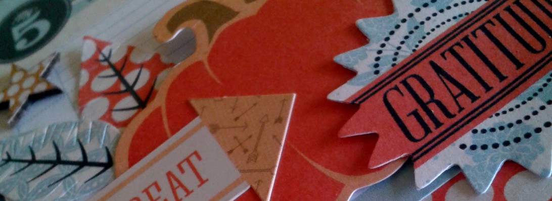
All papers are from Bazzill– that gorgeous texture of the grey, like stone, and the crosshatched orange–delightful!
The back and inside are finished off with some coordinating orange washi.

So in the end, it wasn’t quite the card or the process I’d planned, but I am fairly happy with the result, and I hope I’ve done justice not only to Joni’s work, but to my post as the guest designer over at CASE Study this month. It really has been wonderful working alongside and getting to know some of the very talented ladies on the design team.
I hope I have provided you with some inspiration along the way! I encourage you to get your CASE on and play along with us! Check out the design team’s individual websites while you are at it.

Chupa
Amy Wanford
Clare Buswell
Debby Hughes
Jeanne Jachna
Maureen Merritt
Silke Ledlow
Tasnim Ahmed
Here’s a sneak peak at all the cards I created based on Joni’s design. I will be back tomorrow to talk process and products, and since it’s all about Seattle, I’ll also share some details on an awesome new coffeeshop we discovered this weekend! And a lil’ something about Stamp Nation!

May you aspire in your creative endeavors this and every week!