A Crafty Day and A Clipboard Card

And another weekend draws to a close!  Did you find yourself inspired and productive?  I know I did– and now, not only do I have a product pile-up, but I also have a post pile-up!

But before I get to my card and muses, I must share a bit about my crafty Saturday gathering!  I am not only lucky to live in one of the most gorgeous places in the United States, the Pacific Northwest, but also lucky to live in proximity to some of the nicest and most talented card artists out there, all of whom are likely household names to many of you! One of the most wonderful aspects of this creative journey beyond the act of creating is the people I have met online across states and continents through challenges and blogs.  Being able to meet some of these online friends in person makes it even more wonderful.

So yesterday I had the pleasure of laughing, eating and creating with Katie Brooks of KB Stamps, the Kimberly Wiener of Wienerhoneymooners, Amy Tsuruta of Tsuruta Designs, and Amy’s friend, Laurel.  I didn’t get much card making accomplished, but had a great time sharing supplies and ideas, while accomplishing a lot of die cutting (what else is new lately?!) for a mini album!

Amy was a wonderful hostess, and I wanted to show my thanks not only for opening her home to us, but also for being so supportive in her commenting over the past months since I have become more active in the community.  It is amazing how she makes the time to visit so many blogs and comment on people’s work (in addition to creating, being on numerous design teams, raising kids and working!)  Since Amy loves coffee, I knew I had to bring her a little hostess gift of beans, and of course a coffee-themed card!

I have been working on what I will call “clipboard cards” from recycled cardboard and corrugate.  I am really excited about these! There are so many possibilities for different occasions and aesthetic approaches with these cards.  I plan to complete a tutorial for you once I have some others finished.

Additionally, I’ve been experimenting with different card-making styles to challenge myself, but the one I keep gravitating to is the shabby chic/vintage collage style with a modern and/or mixed media twist as seen in the work of Magda Luczak of Mama Judo, Stephanie Schutze of Scrapmanufaktur, Frau Muller, and the older work of Scrapperia, whose recent work is more modern, on-trend, freestyle collage.

These works in particular influenced my thinking, since I have been thinking about these a lot!

Stephanie Schutze, Scrapmanufaktur
Frau Muller
Frau Muller
Scrapperia
Scrapperia
SONY DSC
Mama Judo


I actually had set out to CASE Magda’s tag card, but went in a completely different direction after playing around with my elements. She has another fabulous tag card over at her blog which I am thinking of CASE-ing.  Her work is just magnificent!
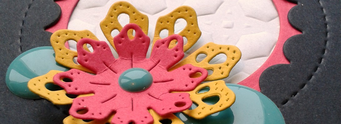
So here is my card!

2014-04-25 18.22.32

2014-04-25 18.23.46

2014-04-25 18.24.09


THE PROCESS:

I measured and cut my clipboard back out of recycled cardboard; I use a lot of legal pads in teaching, and always have the cardboard left over after the pad is used.  Great crafting supply!  I did the same with the corrugated paper, rounded the edges of each, and then Mod Podged them together.

I then distressed my top panel and stamped my coffeestains in Versafine Onyx Black, using stamping off to get variations in hues.

I distressed some scrap paper, and then die cut my little coffee mugs.  I strung them along the hemp twine and finally was able to put my Tiny Attacher to use!  Love those little staples!!

I knew immediately that I had to use Kelly Purkey’s stamp from the I Like You set– which I thought was cute in reference to a cup of coffee!  I stamped that in Memento’s Rich Cocoa onto my tag cut from Avery Elle’s Tag set.  I did not attach the tag to the twine as I wanted it to slip out so the message on the back could be read.  I also like the coffee cups sliding freely along the twine.

2014-04-25 18.26.36

I set out to layer a bit with various papers and the burlap, distressing my 7 Gypsies Conservatory paper with the Tonic Distressing tool.

I die cut the tab from My Creative Time’s Stitched File Tab, and specifically chose a section of the washi to tear and affix to the it.

Then I clipped it all together with the tiny binder clip.

2014-04-25 18.24.51

But wait, there’s a surprise inside!!

2014-04-25 18.27.55

2014-04-25 18.30.59

Some fun confetti mugs and Paper Smooches “Thanks” die cut from various papers and wood veneer.  It’s not a confetti pack without some trendy sequins!  Love those Studio Calico woodgrain ones!  I snuck the vellum envelope between the layers.  You can see it peeking out in photos above.

2014-04-26 08.04.39

The bottom initially looked a little bare one assembled, so I die cut some branches from the Penny Black Nature’s Song die.  I wrote out a message on the back of the tag and then wrapped it all up with some rough twine!

2014-04-26 08.04.11

After our fabulous day together, I headed to Snoqualmie Falls, not far from Amy’s for a nature walk.  Here are some of my pictures!  I so love our PNW forests with the knobby tree-covered trees and mossed branches bending and hanging and breathing life into the forest!

And the neon azaleas are popping out all over now making my eyes pop right out of their sockets.  I could look at them in their varying hues of fuschia, red, and pink for hours!

2014-04-26 14.50.422014-04-26 15.22.112014-04-26 15.34.01

Well, in three minutes, the weekend will be officially over, and it is way past my bedtime.  Instead of popping out, my eyes are about to roll back into their sleepy sockets.  So I won’t be leaving a fancy linked up supplies list this time, but I have listed what went into the card.

This is headed over to CASE Study for the design team call.  There will be a new guest designer as well as a new Muse this coming week! Check it out!

And now it’s lights out for me!

xo

SUPPLIES:

Kelly Purkey “I Like You” Stamps
Prima Paper: Sunrise/Sunset
Crate Paper DIY Shop
7 Gypsies Conservatory Paper
DCWV Burlap Paper
DCWV Woven Paper
Recycled Cardboard
Corrugated Paper
Hemp Twine
Memory Box Mini Cups
Penny Black Nature Song Die
My Creative Time Stitched Tab Die
Avery Elle Tag Die
Tim Holtz Tiny Attacher
Tim Holtz small binder clip
Tonic Paper Distresser
Distress Inks: Walnut Stain, Antique Paper, Tattered Rose, Tea Stain
Versafine Onyx Black ink
Coffeestain Stamp is from Inkadinkado (I think!)
Studio Calico Woodgrain Sequins

Prêt-à-Porter

Bonjour mes amis!  I am back with another card for the Fusion challenge.  This one gave me occasion to bring out my little PTI dress form and some fashionable ladies from the awesome British stamp company Crafty Individuals! 

I received a dress form for Christmas, and she has been more of a model than a hard-working girl as I’ve not put together a dress since 2010, the one in the photo below, actually!

BROWN DRESS 10

Back of Brown Dress

I started photographing my pieces awhile back to catalogue them, and hope to get some better shots up in the Sewing Gallery soon.  I’ve a dress in the wings that needs to be done by May (yikes!) so both of these ladies will be in working fashion and whirring along with the song of my sewing machine soon!

Now, here is Fusion’s inspiration and my take:

2014-04-07 14.29.53

There are some hidden details in this card, which I love!  I used the Ranger ATC folder for the background piece; after distressing it, I decided to file some goodies inside!  That’s a folder’s purpose after all!  I liked the idea of a lady clipping sewing ideas from magazines and storing them in this folder for her reference.  The tab is stamped with partial sentiment from PTI’s Button Boutique.

2014-04-07 14.19.23

2014-04-07 14.18.08

2014-04-07 14.18.41

2014-04-07 14.20.01

I cut some of the images from Prima Marketing fashion paper set and vintage lined paper; then die cut a spiral paper edge with Paper Smooches Borders die.  The Button card is from an American Crafts chipboard set.  And what about that hanger from Ranger???  Irresistible et incroyable, non?

2014-04-07 14.15.35

Here is a close-up where you can see the embossed French script on the bodice.  I stamped with clear Versamark and heat embossed for some glossy sheen.  I stamped my ladies with Memento Cocoa and I love how they fit perfectly in the patterned panel, which is cut from a 12 x 12 sheet of Crate Paper’s DIY Shop.

2014-04-07 14.21.49

The bottom panel is also from DIY Shop; love that it featured April on the ruler!  I covered it with Simon Says Stamp’s Mod window cut from birch wood veneer paper, also from SSS.

2014-04-07 14.22.07

2014-04-07 14.22.56

The inside and back are finished off with some fabric tape. The sentiment is from PTI’s Stitched with Love.

I love the hexagon patterned paper peeking over the edge.  I picked up some great new 12 x 12 papers a Impress a few week’s back.  Now I am wishing I bought two of each!  This particular double-sided paper is Cosmo Cricket “Sweet Disposition.”

Making this card was so much fun and definitely put me in a sweet disposition!

Hope you enjoy it as much as I do.

The clock is ticking down on this challenge, so I better link up!  Head over to Fusion to see what others have fashioned!

Have a stylish day!!


Craft Worthy

Does anyone remember Wayne’s World?  “I’m not worthy, I’m not worthy!”

Well, readers, based on what I have seen of my fellow crafters’ work, I have to say you are, indeed, worthy!

And I would like to take this chance, on the last day of what has been a VERY long month full of some challenging downs, to thank those of you who have provided me with some serious ups!  Fresh Squeezed Stamps spotted my car card and featured it in their Friends Showcase; Paper Smooches picked one of my camera cards for their Facebook page; CASE Study found my sequined cheers card worthy enough for their top 3 (a great accolade); and I have heard from so many wonderful crafters, writers and travelers over the last month.  You all have brought some much needed sun into my corner of the world!

So for all those inspiring creatives out there and for the fabulous sketch provided by The Paper Players this week, this card is for you!

First here is the sketch I worked from:

pp180

I just received my PTI shipment of Button Boutique Stamps, coordinating Button Card Dies, and Stitched with Love Stamps, sets I had my eye on for awhile.  So I immediately knew what I wanted to do with this sketch incorporating the PTI products!

2014-01-31 11.39.41

2014-01-31 11.34.19

This was a pretty labor intensive card incorporating Distress inking on all the papers except the card base.  I used Walnut Stain, Tattered Rose and Tea Stain, creating my button card first, and adding Graphic 45 buttons.  I absolutely love how the design of the stamps interact with the distressed card!

2014-01-31 11.40.16

2014-01-31 11.36.07

I cut the 3 buttons out of wood veneer and cardstock, totaling 3 layers so the buttons would be thicker.  Playing on the wood texture, I added a wood heart from Studio Calico for some added dimension.  Instead of using traditional thread for my spool, I added additional texture with the nubby twine.

The sketch called for a sentiment on the bottom of the card, but none of the ones I have really felt right, so I added the ruler stamp from Technique Tuesday.

2014-01-31 11.36.52

2014-01-31 11.35.26

Since Simon Says Stamp’s challenge incorporates twine this week, and I have been dying to play along with the new challenge “Texture” over at the Card Concept, this little shabby chic creation will be headed over to both sites.

The Card Concept is such a cool spot because they are focusing on the six different kinds of card making styles, which is really helpful if you are a beginning card maker, or if you want to experiment with styles that are challenging or new to you.

That’s it for me today!  I hope you enjoyed this little trip down vintage lane; I’m on a trend lately with early 20th century inspired work, as you may have noticed I upgraded the fonts on my site, with headers in the 1920’s style Brandon Grotesque.  I love the clean, slim, rounded fonts from the nineteen-teens and twenties!

A Clean Slate, or Just a Whole Lotta Dust?

Well, we are already one week into the New Year and the Universe keeps picking up my chalk and writing all over my clean slate!  I know, to quote U2, that “nothing really changes on New Years day,” but is it too much to ask that the illusion linger a little longer?  If this first week is any indication, 2014 may demand a much bigger eraser and a whole lotta strong-arming.  But if that’s how it’s going to be, well then, bring it on; I’m ready for the challenge.

And speaking of challenges, what do we have here?

Okay, Paper Players, I’m game, though I have to admit, this is one technique that definitely challenges me!  Initial attempts have left me fairly frustrated.  My renditions don’t look shabby-chic or imperfectly perfect; they just look like a big old mess!

And then I watched Betsy Veldman’s tutorial on chalkboard technique, which you can find here.   I stumbled across it last week, while checking out Papertrey Ink’s Make-It Monday year in review. Betsy’s work is absolutely charming, and her Paper* Scissors* Superheroes is one site I visit on a weekly basis.

So after watching her video a few times, this is what I came up with:

2014-01-09 13.33.35

A bit chalky, eh?  It being my first attempt using Betsy’s technique, there is much room for improvement.  However, the other elements of the card work, and I will likely create a new chalkboard sentiment to adhere if I plan to send this to anyone!

So a few details about how I used the chalkboard technique.

First, I actually used “chalkstock” paper, as opposed to regular cardstock.  This paper has a waxy finish and can be very forgiving, since you can add water and erase any pigment ink or stray chalk you don’t want.

This is the brand of chalkboard paper I used, purchased at Impress Stamps in Seattle.

Chalkboard Postcards

Second, instead of just stamping the sentiment in white pigment ink (I tried both Cat’s Eye Chalk Ink and Unicorn White; I prefer the Cat’s Eye Chalk Ink), I first stamped and then heat embossed with detail fine white embossing powder.  Becky recommended doing this.

After that, I stamped the sentiment again, over the original, just a little off center, as Becky showed.  This took a few tries, and since I was using this special chalkstock, I was able to wet and wipe.  However, I learned that too much wiping away will eventually change the character of the paper a bit and make removal of the ink harder each time.  A bit like an old chalkboard, though!!

In the photos below, you can see some of the detailing and resurfacing.

IMG_20140109_132139

IMG_20140109_132126

I edged the chalkstock with the chalk ink and when I was done smudging and edging, I heat set my board, which was cut using Papertrey Ink’s tag die.

I just opened a few new goodies, including my Paper Smooches Borders 2 die, and so I thought that would perfectly compliment the school theme of the papers and Lawn Fawn’s notecard die.  The ribbon was repurposed from the handles on an Anthropologie bag!

The quatrefoil embossing folder from Lifestyle Crafts reminds me of a chainlink fence around the playground, so I thought that would work as a background texture.  The Kraft paper is heavy weight from Gina K.

IMG_20140109_132220

The inside of the card features my Graphic 45 buttons; the larger one is a clock and the smaller a dictionary entry for the word “unique” & “timeless”.

IMG_20140109_132230

My signature washi tape adorns the back; I just love teal with red and yellow.  Looks like I need to update my tags, though!  Hello 2014!

IMG_20140109_132332

That’s it for today!  I am wishing you all happiness in your creative endeavors.  Thanks, Becky, for your awesome tutorial and to the artists over at Paper Players for pushing me to finally attempt this technique!  Head on over and see what others have done with their tabula rasas!

Old School!

Paper Players Challenge: Taking it Way Back

Remember Formica countertops in saffron and olive drab?  What about the Corelleware like this:

Vintage Corelle creamer 70's

And this:

Vintage Butterfly Gold Corning Corelle Cups and Saucers

Well, the Paper Players had me traveling back with their color challenge this week!

So here is my super CAS take on their delicious and nostalgic color combo!

IMG_20131115_113158

But wait, there’s a surprise inside!

IMG_20131115_113327

Slip the twine down and there’s the sentiment!

IMG_20131115_113629

All inks are Fresh Inks in Pumpkin, Harvest, Chocolate and Slate!  A bit of textured chocolate paper embellishes the front!

I used Gina K. heavy and layering weight paper in Ivory.

The camera and phone stamps are from Stampendous; the adorable typewriter is Rubbermoon.  I stamped, embossed, and fussy cut them.  The letters are from Graphic 45‘s vintage set of woodblock letters, numbers and symbols!

Whew, I cannot believe I made it before the deadline!

Now snap to it lickety-split and check out the other fantastic takes on this color combo at The Paper Players!