Monday was so busy that despite having the cards and photos completed and in queue, I couldn’t get to the composition of these posts! So I have a double-hitter today! See my other post here.
For my next card, which also features pink prominently, I worked from Wida Miller’s inspiration this week over at CASE Study. So excited she is the muse this month!
Here is her card:

And here is my take:

A bit more ethereal than Wida’s– but what I started from was her double frame and square orientation. I just received my Penny Black Feather and Frames dies, and when I saw her card, I knew the double frame would be perfect.
I’ve not jumped on the feather bandwagon–though I have some feather embellishments and stamps floating around (pun intended!). Her card inspired me to give the trend a try.
I also found myself echoing Amy’s design with her silver lining! Love her card!

This card was so fun to put together– especially given the gorgeous papers that came in these amazing Crate Paper/Amy Tangerine discount packs at Michael’s (thanks for the tip, Amy Tsuruta!!). My card and the backdrop papers are specifically from The Best of Maggie Holmes pack. The tan base paper is from Crate Paper’s DIY Shop.
You can’t see it in my card, but the pink paper layer has bokah hearts all over it, a nod to Wida’s heart paper. I’ve placed the card on the paper so you get an idea of what lies beneath!
I like that the hearts are hidden like a secret beating within the body of the card.

I strategically cut the cloud paper and covered it with a layer of vellum, adhering with a little Scotch vellum tape before I stitched the top.
I also cut a specific part of the bokah paper that looked like a sun and placed that behind the frame, so it looks like the sun and it’s halo are peeking from the cloud range.

I cut the sentiment from a notecard in the beloved Lucky Charms pack and distressed it with Tattered Rose, as it was too white for the card.
I also Distress inked my feather with Worn Lipstick stain, and then spritzed with Heidi Swapp Coral mist to get the exact pink I wanted– along with a little sparkle!

Here is the inside of the card, featuring a Verve Stamp that I just love!

Now, I initially did not include the sequin on the bottom of the card. After taking photos and stepping back from the finished product, I just felt like something was missing. I think the addition of the sequin creates a nice line and adds subtle visual interest. What about you? To sequin or not to sequin?
BEFORE:


AFTER:

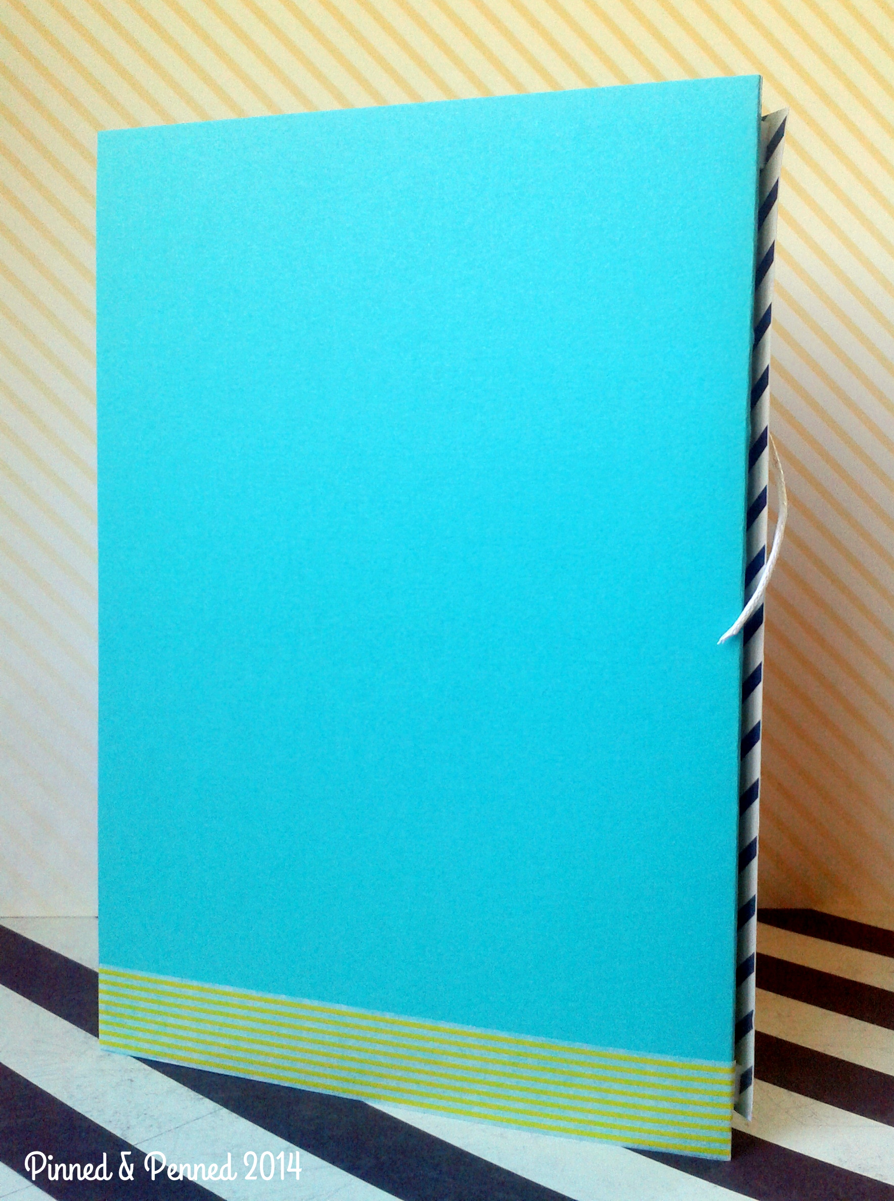
The bottom is finished off with some Little B washi!
I thought this card would be perfect for someone working through a difficult time. Even in our darkest moments and most challenging days, we need to hold onto hope and move toward the light while we sit with the uncertainty. I think it’s important to remember the difficult days as it helps us to appreciate the better ones that will most certainly follow.
I hope you are having a wonderful week– but if not, may you find the feathers you need to lift you up and the silver linings to make your cloud seem a little less grey.
Thanks for stopping by! Head over to CASE Study and Curtain Call for some uplifting creations!

P.S. Almost forgot my crafty cat Leo who loves the tulle and keeps me company!

And Atticus who is CSO (Chief String Officer)