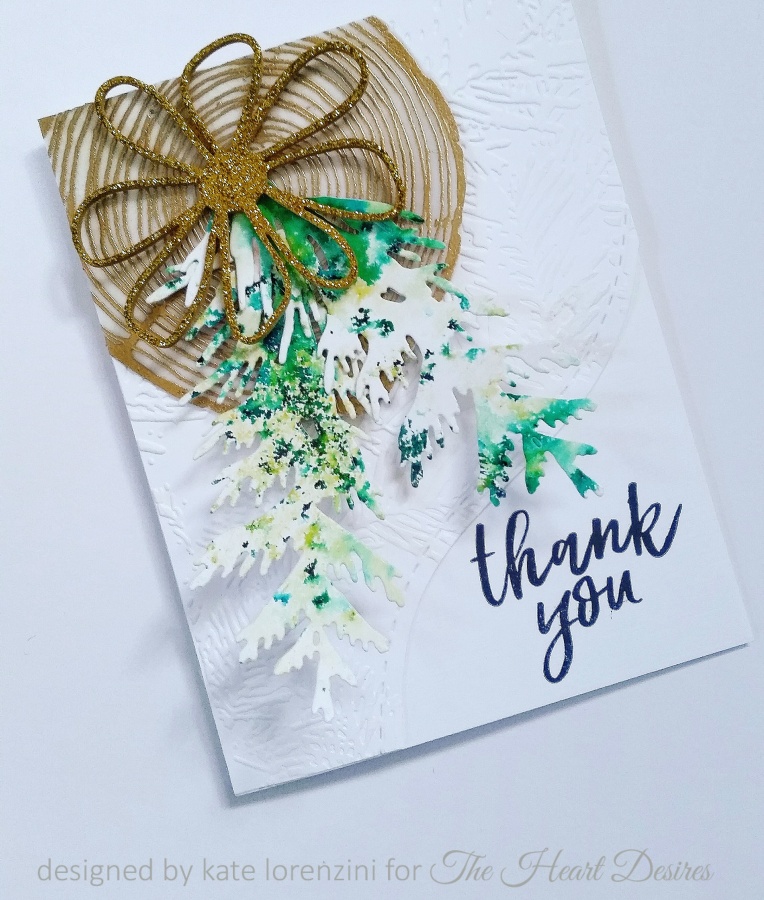
Hey everyone! It’s my first post of 2017 over at the Heart Desires Blog, and I am featuring a combo of lovely products available in the store. You know you need some holiday thank yous! Stop on by for some inspiration! See you there!

Hey everyone! It’s my first post of 2017 over at the Heart Desires Blog, and I am featuring a combo of lovely products available in the store. You know you need some holiday thank yous! Stop on by for some inspiration! See you there!

After a very un-calm week, I was keeping so calm at the end of each day that I never got around to this post. I was definately on island time in the creation, photographing, editing and posting of these cards. All in all, about 2 1/2 weeks now. Our mini heat wave here in Seattle is partly to blame– a 90 degree studio and exhaustion from both the heat and teaching didn’t really create the prime conditions.
I took to a kayak last night because I was too tired to trek to the outdoor pool and swim laps, but needed the relief of water. It was a glorious night and there’s nothing better than being on, in or around the water at sunset. Fires in the Olympic National Park are creating paradoxically stunning sunsets–neon pink and purple striations. But I am not ready for their earlier and earlier arrival. And today, it’s windy, grey, and COLD– something I am also not relishing.
So let’s pretend that we are in the tropics, shall we?


I started with the ombre palm background using the set Say Aloha by Kaisercraft available at The Heart Desires store, stamping in three different green pigment inks.

I stamped the flamingo from the same set, wet embossed with some sparkle powder, and fussy cut, then set to layering. The hibiscus is from CottageCutz and is cut from hand-colored alcohol-inked glossy paper. Note the ombre effect on the flower/leaves. Love that Little B pineapple!

I cut my sentiment banner and stamped with Delicata Gold and heat embossed. The gold palm is a new die from Savvy Stamps.

Love the sheen of the glossy paper and embossed inks.


Everything was layered on 110# Wood embossed paper and the inside finished with one of my most favorite washis. The banner needed more of a focal point so the triangle enamel piece pulled it together and echoes the washi. It also is the same color as my glossy paper.

Card 2
The next card is a variation on the theme.

This time I used more of the ferns and fronds from Say Aloha and ones from Hero Arts Stamp Your Own Plant both available at The Heart Desires. Again, I chose a selection of green pigment inks. Tonya has some of the lovely Hero Arts Hybrid inks in a variety of greens–Moss, Green Apple, Pine–that would work well.
The hibiscus and palm dies make an appearance again– this time in coral card stock and wood paper respectively.
A few Savvy and Julie Ebersole flowers were cut from stock and glossy alcohol papers and layered in. Everything was placed upon the Concord and 9th’s Tree Ring, stamped in Hero Arts Unicorn White and heat embossed on vellum. The wood paper panel is from the Bloom set. Ink, stamps, and paper are all waiting for you at The Heart Desires as well!


The inside is finished with ombre-metallic washi. You can see how I layered my gold sentiment die with some glitter foam.

Now if these colors and designs are reminding you of something, it should be our current challenge!

You have 5 more days to play along, so I hope you have found some inspiration here today!
Keep palm and have a creative weekend everyone!

On a morning like this when the light-filled studio is just below baking and the air, thin and cool, teases relief through a cracked window, thoughts turn reluctantly to December, though I know it looms. Thus, by this point in the summer, the ease and possibility of June and July give way to urgency. I register the changing light of August and begin to count. How many weeks until the new school year? How many remaining days at the pool? How many sunset hours left to kayak?
And of course, how many holiday cards left to make?
This last question is laughable because I rarely make cards or seasonal gifts for any holiday or birthday during the off-months– and the ones I do complete in advance struggle to find their way into the mail or hands of their recipient (apologies to family, birthday buddies, boyfriend…)! Case in point: all tardy 2015/2016 holiday, birthday, mother’s day, father’s day, get-well gifts were meant to be part of a Christmas in July celebration I’d cooked up, but it’s now August.
And so it goes.
I am often too busy sucking the marrow of each moment (or worrying that I’m not making the most of that moment) to think about and plan for some elusive future. It’s a way of being that certainly has its benefits, but also some costly downsides.
And being a dopamine-driven creative short on time and long on distraction, I know I’m not alone in this!
One card likely won’t turn the beat around, but for a few blissful moments as this piece came together, and visions of more danced about, it was beginning to look a lot like Christmas in my brain…

The designs by Savvy Stamps, Julie Ebersole and Neat and Tangled all complement one another so well, and the ones featured here are some of my favorites– if you follow my work, you know they are in heavy rotation!! Nearly all products used on this card, which is being submitted to their Pinsights Challenge, can be found at Ellen Hutson.
So first the tree ring. I’d been plotting its possibilities since the stamp was released by Concord and 9th last year– and it takes center stage here with bold, black embossed vellum, fussy cut, and then layered with an array of Savvy Stamps and Essentials by Ellen dies. My second favorite element? That Brushstroke Joy sentiment cut from Essentials by Ellen 110# wood embossed paper and layered with pink mylar! Look at that iridescence!

The Savvy Woodland Branch is cut from cherry woodgrain paper; the Wild Garden berry sprigs from Essentials by Ellen #110 wood embossed paper, and then embellished with icicle Stickles. This thick turquoise glitter paper from American Crafts is probably my favorite glitter stock ever (it comes in gold and garnet red, too), and it works perfectly for floral die cuts like these, also from Wild Garden; the large flower petals are partially adhered and popped up for interest.

Savvy Stamps Flower Blossom #2 is one of my favorites of the set, and I love the flow that this leafy sprig creates. It has been cut from Jen Hadfield gold stock.

Finally, Neat and Tangled’s Hexstar cover die cut from Jen Hadfield DIY gold woodgrain paper is slightly manipulated and then layered over EBY 110# woodgrain paper and dotted paper from Maggie Holmes Confetti line.

One last look at the dimension created by the layers.

Even if the holidays, or traditional holiday colors, or merely the thought of winter make you want run and bury your head in a scorching mound of sand, I hope my non-traditional take on the holiday card coaxes you into creating some of your own before the stress of the season bears down!
And with that, I’m off to the pool!

Happy Thursday everyone and welcome to the last Fusion Challenge of March! This week we are featuring Orchid Occasions with this gorgeous aqua and pink combo!
I absolutely love these colors and knew right away the papers I wanted to feature. Since it’s my last week with Fusion, the last day of March, and the end of a great company, Basic Grey, I made not one, but two cards to bid farewell to all three and go out with a bang!


My first card is a tropical twist on Easter! I spent quite a bit of time on the beach Saturday as it was in the 60’s and finally sunny. Beach living is always an inspiration, so that along with the colors in the photo and Easter holiday, prompted this piece.
All papers are from various Lilypad digital collections printed on Kodak matte photo paper.
The base paper is a tie-dyed design, which made me think of coloring Easter eggs! The pink and rose floral paper replicates the orchid’s colors perfectly with their dark pink centers.

The Spellbinders feathers, Savvy grass die, and Prima resin eggs round out my beach scene.
Now for the eggs! I originally had layered three ovals; however, I realized that these should be eggs, but I didn’t have egg dies big enough! What to do?

I am sure someone, somewhere has thought of this, but it was an a-ha moment for me! Your oval die cuts can easily be made into egg shapes of any size by using a circle die to cut the bottom. Then you just need to round off the corners with a little fussy cutting and voila, egg!

To give the eggs a little more depth, I adhered three layers and popped up the Happy Easter one with foam squares.
Card 2: Farewell Basic Grey

As many of you know, Basic Grey has ceased their paper crafting portion of the business and is focusing on fabric and digital prints. I was shocked to learn of this in January and am sad to see them move away from paper design because collections like Urban Luxe, one of the last released, Persimmon and Spice Market to name a few, really speak to me. Trendy, funky, and just plain beautiful, most of their collections were a must-have and entirely horde-worthy in my book! So for the next card, I incorporated some embellishments from the Urban Luxe collection.
Many of the papers in Urban Luxe would have worked with the inspiration photo, but I opted to stick with the Lilypad papers. I incorporated the sketch loosely in my card as well. If you look closely in the photo above, you can see how the flamingo bodies flow almost seamlessly into the pink floral lines of the underlying paper!

The gorgeous grey leaf, watercolor flower, and watercolor love sentiment are all from the embellishment pack. I love how they look against the aqua flamingos!
 If you look closely, you can see the watercoloring on the black/white paper; it has blue washes throughout the print that are lovely. The inside is finished off with some geometric washi that echoes the lines on the papers.

That’s all for me! Hope this double dose of inspiration and the rest of the Fusion team spark your creativity! Thanks so much to Fusion for having me this month! It’s been an honor to be part of the team!
Thanks for spending some time with me today!

Well, happy new year and happy February everyone! I hope the first month of 2016 has been inspired and fulfilling so far! For me, it has been a merry-go-round of catch up after a demanding December. I had planned to use my holiday break from teaching to finish some home-related projects and creative pursuits, but ended up derailed. The last few weeks, though, I have enjoyed a burst of creative energy, using my spare moments to put together copious thank you’s, birthday cards, a gift set, and some holiday cards for next Christmas!
A few of those cards were inspired by Fusion’s 2nd anniversary photo and sketch, but I missed the deadline! Boo! Those will be featured soon in my portfolio pages. So today I have a few cards developed for the current Fusion theme and inspired by a selection of digital papers from The Lilypad.

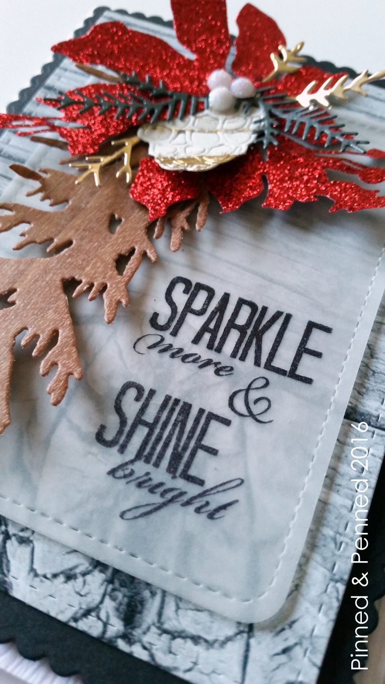
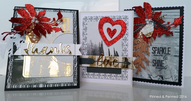
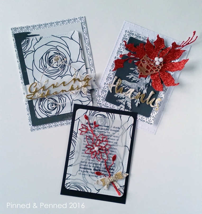
My first card used the sketch and neutrals, emphasizing the black and white in the wreath, and adding some glitzy crimson, that is definitely not neutral!

The black and white papers are from The Lilypad’s new collection, “Cheeky,” by Valerie Wibbens. I cannot get enough of the brushstroke paper which has been layered beneath Jen Hadfield’s gold bark cardstock. Oh my gosh, this paper! I love all the papers she puts out– her gold cardstocks are the best! This paper just took my breath away. I cut the piece from Lawn Fawn’s journaling card and then used the My Favorite Things circle die to cut out the side.

I love texture, and the pictured wreath is quite textured, so I worked in some PTI embossed paper for the banner die, swiss dot paper for the Savvy Stamps woodland branch, and cherry veneer paper for the Savvy Stamps pinecone. The “thanks” sentiment is from the popular PTI wet paint series cut from Jen Hadfield’s texturized gold paper, which is somewhat noticeable in the photo. Penny black provides the poinsettia die.
You can get a sense of the sparkle in the gold bark paper in the photo above. It is so lovely.
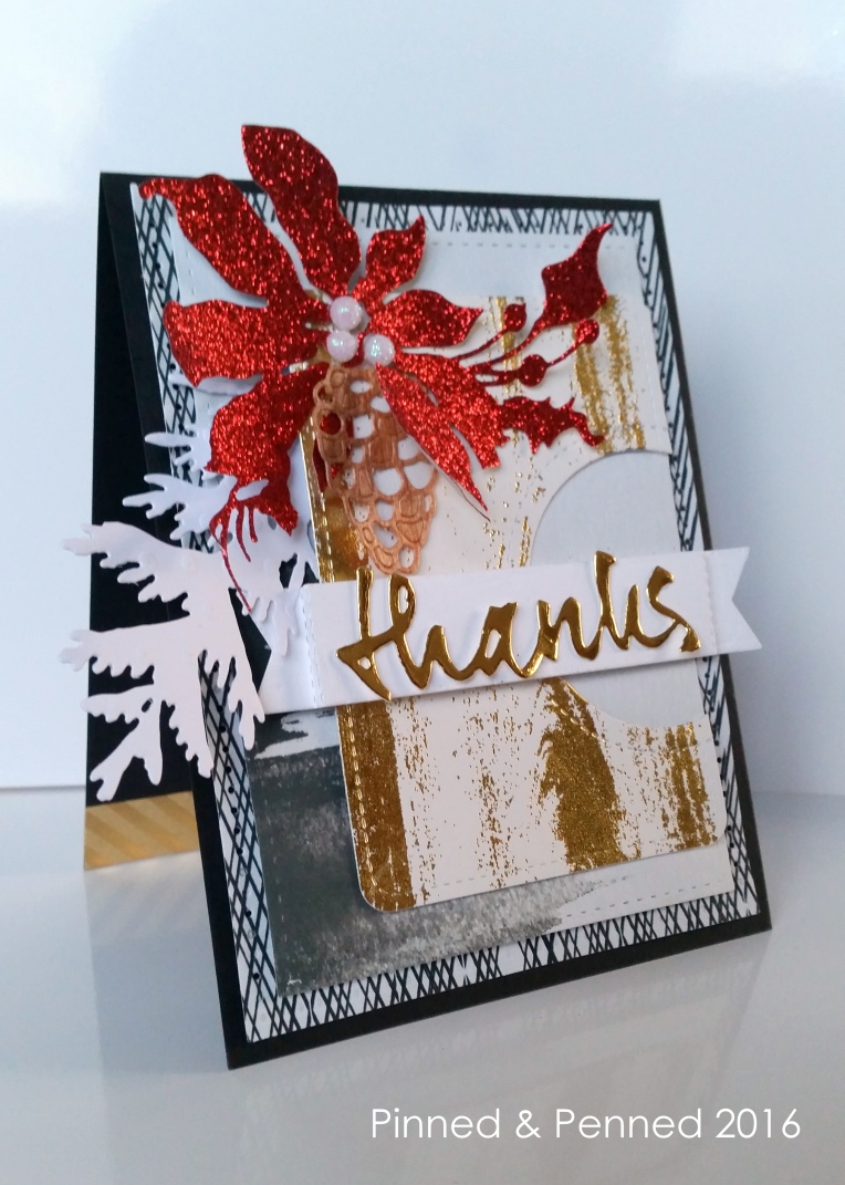
The inside is finished off with some kraft and gold striped washi. I plan to write out a greeting in gold pen.
Next up: This card is a bit out of focus, but I didn’t notice until upload! Whoops!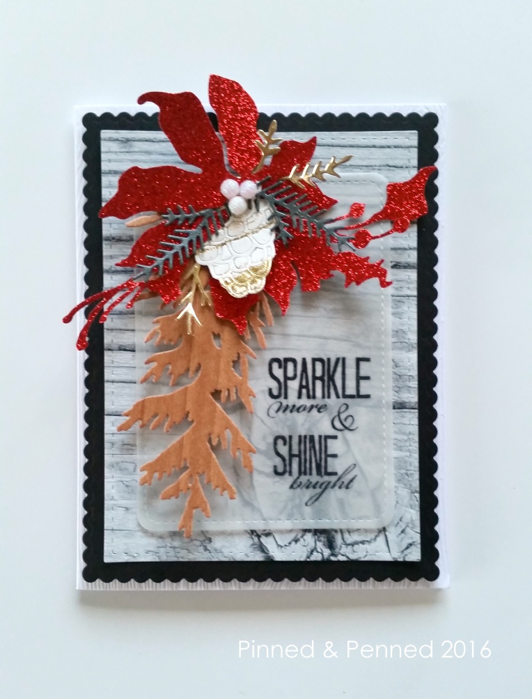
Lots of woodgrain to play off the background in the inspiration photo. Again, the grey wood paper is from The Lilypad collection. I have also used Essentials by Ellen 110# woodgrain paper for the base.
All dies are from Savvy Stamps: DIY Wreath, Woodland Branch and Pinecone. The sentiment is from The Ton stamps.


Keeping with the theme, I created some other glitzy, rich, holiday thank you cards, and a valentine, all of which I will post separately in my portfolio! But here are some images.
Head to my portfolio pages, link found in the menu or on the home page, to see the rest of the collection. You can also see additional photos and new work on my Instagram and Flickr accounts, linked at the bottom of this page.
On my way out, I want to dedicate these cards to all the awesome crafters who participated in Taheerah’s Advent Calendar hop. The turn out was phenomenal, and so many amazing people, many of whom are new to me, stopped by this site, left lovely comments, and even decided to follow. I appreciate everyone and wish I could have contacted each of you personally– the response was truly overwhelming! So thank you!
Drop by the Fusion page to follow the inspiration. It’s one of my favorite challenges out there!
And tune into to see if the groundhog sees his shadow… will there be 6 more weeks of winter? I love sharing my birthday with the furry critter, and either way, I’m harboring a sense of spring inside. Stop by again soon for some cards that reflect the coming season!
XO
