Hello from Seattle!

Good afternoon, all! As promised I am back with my second post featuring the other cards I created based on our current challenge over at CASE Study.  If you haven’t dropped by CASE or read my post from yesterday, make sure to check them out, get inspired, and play along this week with us!

Thanks!

Before I get to my pictures and products, I want to send a warm hello and thanks to all my new followers here and through Pinterest!  I also want to thank Chupa of Random Acts of Creativity, and owner of CASE Study, for the  chance to join the fabulous team over at there this last month, alongside the incredibly talented Sarah Gough of Thinking Stamps!  I have had the opportunity to reach a greater audience and meet more talented creatives as a result!  I am excited about growing my network!  So the cards that follow are for you all!  Hello from Seattle!

Stamp Nation

Additionally, last week I joined Stamp Nation, run by the energetic and passionate Catherine Pooler!  After hearing about it from Maureen of MamaMo Stamps and Chupa, I just had to check it out.  I have experienced a wonderful welcoming over there and encourage you to explore all the community has to offer in the way of videos, discussion, and inspiration!

News from the Industry

Lastly, a bit of news I thought I would pass on!  I just read that Tasnim, a design team member at CASE Study, and the brains behind the stunningly clean and not-so-simple cards over at Cards & Bookmarks has started her own stamp company, Altenew, with Jen Rzasa of Our Change of Art!  So they will be bringing some awesome combined talent to what will be fresh, artful, modern designs!  See either site for the details! Congrats, ladies!

Jen Rzasa’s card from their new set of stamps!
altenew-stamps[1]
Tasnim’s Card featuring their new stamps!

Okay, now on with the show!

Here’s Joni’s inspiration card just to remind you!

CSC184

2014-03-25 12.06.36

Since the card I featured this week at CASE was giving me such a hard time, I decided to try a few different options.  This one here I really like in its graphic CAS style.  I followed that center line that Joni established in her card with the positive and negative die cuts.  I used my turquoise vellum here as well.

I had really wanted to experiment with Ranger’s Crackle Accents as I had it in mind to create a rain-like appearance on my buildings, but I wanted more texture than what Glossy Accents could provide.

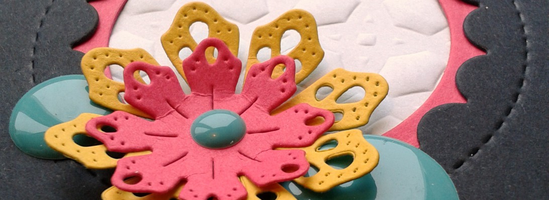
Here are some close-ups:

2014-03-25 12.08.43

2014-03-25 12.07.52

I like how it turned out, but I was pretty controlled in my application on both cards.  So I think freeing myself up a bit, experimenting with more coverage, might make a better impact and more visual interest.

Here is the other card using the Crackle Accents, and this time a much softer, ethereal palate inspired by Joni’s pink vellum leaves.

2014-03-25 12.11.34

2014-03-25 12.12.03

This time I created the front panel with Crate Paper’s DIY Shoppe water-color paper, and adhered it to Bazzill’s Robin’s Egg cardstock– this color is out of this world!!  I decided to use the silver vellum umbrella for a little shine and added clear sequins for some rain-droplet sparkle.

TECHNIQUE: STAMPING OFF

I love my Color Box Charcoal pigment ink, but decided to stamp off on a scrap then stamp onto the panel as it created this lovely soft grey that worked so well with the “watercolor” paper it almost looks like it is part of the background.  I didn’t have any grey in my collection close to this, so it was a perfect technique.

So stamp off to create a color you might want but not have in your collection– works well with your darker pigment inks!

TIP: HEAT SET YOUR INK!

And remember, heat set your pigment and oil-based inks, like Versafine.  If you don’t, smudge is bound to happen.  If you smudge the Versamark and catch it early enough, a good art eraser might be able to take up the still wet ink (I had success a couple times with small smudges).  But once it sets, that’s it.  So get that heat gun out and fired up!  It takes an extra minute, but it’s worth it!

SCRAP POSTCARD

Finally, I had a little scrap piece from some water-coloing and misting a few week’s ago.  I liked what was left over and when I stamped on it, I liked it even more.  So I made a postcard!  I used Lawn Fawn’s You’ve Got Mail.  Super simple.  I may put in a vellum envelope and send out, as it would look good behind vellum!

The scrap was adhered to 100# cardstock with Mod Podge, so it is stiff and durable.  All stamping was done with Versamark just in case I do send as a postcard, then the ink won’t run.

2014-03-25 11.59.03

2014-03-25 11.58.27

And all four creations together!

2014-03-26 10.54.02

SOME PRODUCTS:

Memory Box Petite Umbrella (my favorite out there of umbrella dies!)

Seattle City Die

Hello From Seattle Stamp

Bazzill Paper Pack


CAWFEE TAWK

Well, since the theme is Seattle, I must share with you a fabulous coffeeshop that is relatively new to our area and following in the footsteps of some other great third wave coffeeshops that are here and taking hold in other major cities around the US.

Over the last few years, my partner and I often found ourselves bemoaning the lack of decent coffeeshops in the very city that is supposed to be known for coffee!  After our travels to Vancouver, BC, Chicago, New York (yes, even New York City (not typically known for quality coffee offerings), and even more incredibly our hometown of Rochester), Salt Lake, and of course the darling to our south, Portland, we just could not get over how far behind Seattle had fallen in the world of coffee.

Within the last two years, though, our Emerald city seems to be catching up, and the latest addition to the scene is Slate Roasters in Ballard.

We dropped by on Sunday for a flight of single origin coffees, all of which were delightful, and happily the service was equally so.  We geeked out on coffee talk about bouquet, flavor profiles, chemistry, complexity, and mouth feel with the baristas.  Yes, folks, just like with good wine and beer, the dimensions of coffee are incredibly complex and exciting, affected not only by varietal, processing, roasting, grind, and preparation, but by temperature, food, and the chemistry of your own mouth.  A world of wonder in that little cup of America’s favorite legal drug!

fincalospinos
My favorite of the three coffees we tried; layered, complex, juicy fruit upfront, wafer cookie and light chocolate at the end. Phenomenal!

So if you are in the Seattle area, I recommend a stop at Slate.  Be prepared to kick back and enjoy.  This ain’t no Starbucks!

Heading to Chicago, New York, LA, Salt Lake, Vancouver, BC, or Portland, OR?  Check out my other recommendations for coffee pleasure in my links on the right sidebar!

The latest issue of Imbibe will walk you through the libations of the Pacific Northwest and Seattle’s fall from and slow rise back to coffee greatness, including a feature on Slate Coffee Roasters!

IM48 MA14 Cover310x400

Want more recommendations for places to see in Seattle?  Check out my post here.

Thanks for stopping by today, and let me know if you’ve found any coffeeshops in your area or travels you would recommend!

May your cup be overflowing with creativity today!


Expectations and Aspirations

For the past month, I have been delving into Dickens’ Great Expectations with one of my students.  As a teacher and student of literature, I have read my share of ol’ Charles, but never this tome.  It would be easy to get lost here in the mists and marshes of my own ideas about the novel, but I will spare you all but one thought since I’ve got some cards waiting patiently in the wings!

As I prepared my lesson on aspects of irony in the novel (not the least of which being the title!), I got to thinking about the difference between expectation and aspiration.  Expectation connotes a sense of certainty, deservedness, and righteousness. It is a passive act; expecting is waiting, or literally a “looking out for” (“spectare,” from Latin, meaning to look). In the novel, the characters’ expectations and consequent attachments to particular beliefs lead them to not only make poor decisions, but also cause them deep unhappiness. The greater the expectation, the greater the devastation!  Poor Pip!

On the other hand, aspiration, which literally means to breathe in, carries with it a more positive, and active connotation.  The Latin root “spirare” (to breathe) is related to “spiritus” or spirit.  When one aspires, one strives or breathes toward a higher purpose.  The goal or desire will not simply be had just by waiting or thinking it will be so. There is work, life force, flow and action involved!

So how does this all relate to this week’s final CASE Study design?  I approached my card with an image in my mind and an expectation that it would manifest as perfectly as I’d perceived it. I had my own great expectations for this piece.

And as a result, I experienced a deeply unsatisfying and frustrating session when I attempted to make my vision a reality.  There was no breath, and no flow.  And then there was very little time to revise.

So there my card lay as I contemplated expectation and aspiration and hyperventilation, and prepared for my student’s lesson that afternoon.

You know what they say about the best laid plans of mice and men…(Okay, okay get back on the shelf Steinbeck!)

It took until yesterday for me to be able to see the card with new eyes, rip it apart, start again, and then find something still missing after I had taken and edited all my photos for submission!  What a comedy of errors!  I was dreadfully afraid of how the image would represent over at CASE since I captured it at night under the garish glow of an overhead light!  Happily, it doesn’t look as horrible as I’d expected.  (There’s those darn expectations again!)

Joni’s Card

While I loved all of our muse Joni’s cards, this one particularly struck me in its ethereal beauty.  That breathy pink!  The layered vellum!  I remember seeing it on her site when she first posted it and I was immediately drawn to it.  Let’s take a look!

CSC184

And here is the final incarnation of my card!

2014-03-26 10.46.55


I knew I wanted to follow lines of Jodi’s card, and originally envisioned the city as the centering point, with vellum and cardstock umbrellas dancing beneath just as her leaves are doing below the sentiment on her card.

However, hard as I tried, those umbrellas just wouldn’t work.  They seemed to overpower or compete with the city.  There was just no flow!  I won’t even get into how I ruined the top of that nearly completed card by smudging black ink on it.  Then I cut it too short and it was really all over then baby blue.

TIP: Make sure to ALWAYS heat set your pigment and Versafine oil-based inks!! Even if you think they have dried after 30 minutes!!!!

2014-03-26 10.56.30


I recently purchased some PTI vellum cardstock and gorgeous turquoise and silver vellum at Impress Stamps. I wanted to capture the airy feel that the vellum conveys, and so in my final incarnation, I laid a panel of the turquoise down and tried a couple of my “cloud” scraps (left over from the Avery Elle Love Notes pockets I made last week, seen here).  That seemed to work.

But when I returned to my card and saw it in pictures, it just felt off.  I kept wanting a black and white stripe along the bottom of the city, but none of my washi looked right.

So it was, at long last (11pm to be exact), the addition of baker’s twine that tied it all together (pun intended!).

CASE Close Up

Another aspect of the card that was inspired by Joni’s is the subtle, airy sparkle of my stenciled raindrops (really they represent the tears I shed and the HELL-o this card gave me! 🙂 )

I used Kelly Purkey’s stencil, Heidi Swapp’s Color Shine in White., and some masking to achieve the background.

All papers are from Bazzill– that gorgeous texture of the grey, like stone, and the crosshatched orange–delightful!

The back and inside are finished off with some coordinating orange washi.

2014-03-26 10.46.18

So in the end, it wasn’t quite the card or the process I’d planned, but I am fairly happy with the result, and I hope I’ve done justice not only to Joni’s work, but to my post as the guest designer over at CASE Study this month.  It really has been wonderful working alongside and getting to know some of the very talented ladies on the design team.

I hope I have provided you with some inspiration along the way!  I encourage you to get your CASE on and play along with us!  Check out the design team’s individual websites while you are at it.


Chupa
Amy Wanford
Clare Buswell
Debby Hughes

Jeanne Jachna

Maureen Merritt

Silke Ledlow

Tasnim Ahmed

March Guest Designers: 

Sarah Gough

Here’s a sneak peak at all the cards I created based on Joni’s design.  I will be back tomorrow to talk process and products, and since it’s all about Seattle, I’ll also share some details on an awesome new coffeeshop we discovered this weekend!  And a lil’ something about Stamp Nation!

2014-03-26 10.52.28

May you aspire in your creative endeavors this and every week!


Every Dog Has His Day

Well, hello there partners!  It’s been a bit quiet around these here virtual parts.  The noise has all been happening my “real” world of work, personal, and exciting creative commitments the past 2 weeks, so the site has lain silent a bit longer than planned.  I wish it were still March 4th, so I could say, “Now it is time to March forth…”  and have the pun be relevant!  Pretty good, don’t you think?  I love a double entendre, and if you haven’t noticed, anything witty and wordsmithy!

So tomorrow I will be happy to reveal some thrilling news and corresponding work that I hope will be inspiring to you!

In the meantime, I will share some recent watercolor work that was prompted by play and, unfortunately, necessity.

This is heading over to Virginia’s new challenge, first up, watercolors!

watercoloring

Recently several clients have lost human and animal family members, so I have been working on some sympathy cards for them this week.  Completed is a card for a family who lost their beloved dog of 18 years last Saturday– 18 years!  While losing an animal companion is certainly different than losing a human one, it is nonetheless a traumatic event that significantly alters one’s life.  And anyone who has nurtured an animal from infancy, or a young age, to adulthood knows the incredible bond forged between two species that transcends verbal communication.  It is a relationship that teaches selflessness, incredible patience, and commitment if one really takes the time to listen and understand the ways of a creature, who in many aspects may not be entirely different from you.  I often feel like a little zoologist in my humble habitat as I observe daily the intricacies of my cats’ behaviors and moods, and their shifts and development over time.  For example, just as we grieve our humans and animals, our animals also grieve, and witnessing this in my cat, Atticus, was a complete paradigm shift for me as I watched his attitude and behavior drastically change upon the loss of his best friend, Claude.  It took about 8 months for us to have our Attie back to “normal”, though since Claude’s untimely death, Atticus has retained a level of clinginess we’d not experienced before.

So I find it appropriate to honor the life and passing of our animals just as we honor the life and passing of our fellow humans.  I hope my little card here does just that for it’s recipient.

2014-03-05 09.15.41

Watercolor has been taking the paper crafting world by storm; therefore, I decided to dabble a bit.  It seemed an appropriate choice for the content of the card.  I initially began playing with Distress inks and my Paper Smooches Paws for a Cause dog stamp (partial proceeds from this stamp set will go to Home for Good, so buy this set for you or the animal loving stamper in your life); then I moved on to the paws!  I have a series of these “dripping” paws which I will showcase later.

The watercoloring/stamping technique pulled me in so much once I started, I couldn’t stop!

Below is a series of my dogs that I created.  Click on any image to enlarge or watch a slideshow.

So the technique… I initially inked my craft mat with Distress in Stormy Sky, Faded Jeans, Crushed Sapphire, Peacock, and Tumbled Glass.  For some of the stampings, I directly inked the stamp, stamped on watercolor paper, and then stamped again with another color, adding water either to the stamp or to the paper with my brush.

For other applications, I added multiple ink colors to the stamp, sprayed with water, stamped, and then re-stamped partially with a particular blue or blues.  I then went in with my paintbrush and added color here and there to the image, moved color around, altered perspective in the dog’s head with the addition of color (in images some it looks like his head is turned, in others it looks like we are seeing the back of him).

Overall, I really just played around with the ink and water both on the stamp and on the paper, sometimes intentionally manipulating the color or flow, other times working more spontaneously.

I worked the same way with the paws, though in this card, the paws were just stamped once, the dripping was stamped once then manipulated with a brush.

2014-03-05 09.16.04

The dripping is from Fresh Squeezed Stamps’ set “On Trend.”  Sadly, if you didn’t already know, the paper crafting community is mourning the loss of that stamp company.  Their “On Trend” set is one of my favorites of all stamps from any company.  I will be sad to see them go.  They produced quality stamps that were quirky, fun and definitely on trend!  Right now they are offering 30% off all merchandise until March 31st, so check them out before they close for good.

And speaking of closing (but not for good!), I will bring this little entry to it’s end, as I need to prepare tomorrow’s post, and check out what some of my crafty friends have been up to!  I am feeling pretty out of the loops, so it’s time to do a few around the blogosphere, dropping some love and picking up some inspiration along the way.

And if you have the time, drop me a line!  It would be great to hear from you!

Like Bob Barker used to say at the end of the Price is Right, “Help control the pet population. Have your pets spayed or neutered!” and, I will add, consider adoption first, as well donating to your local rescue group!  Every little bit helps a furry friend in need.

xo Kate, Atticus & Leo

2013-05-15 12.28

Make You Jump!

I am loving all the word inspiration that Cas-ology is throwing our way lately.  So much fun!  This week’s word was Jump.  So I hopped to it inspiration-wise, but after sketching and prepping my designs, the cards had to wait until today to be executed.

And of course, when it came down to it, they took me longer than planned, and found me dithering quite a bit–I am moderately happy, though, with this first cheeky card that resulted.

2014-02-23 13.18.06

I wanted very badly for Catman’s cape to look a bit more authentic with an insignia and more fluidity, but I was struggling with paper choices and getting it just right; none of my die letters or stamps looked right–but as I write this, I just realized I didn’t try my sparkly Thickers.  Hmmm….I will have to try that out and update if it’s a success.

Well, anyway, I finally settled on the stripe, which ended up altering the entire color scheme from a primary, bright palate to a muted one–hence, Catman’s Robin turned into a bluebird!

So, now he kind of looks like he’s wearing a cut-up pillow case or sheet.  And, who knows, since he’s Catman, maybe he is.  He’s the superhero of the house, keeping the kittens in line, listening to his wise bird friends outside.  You know, being a super-cat on the inside!

2014-02-23 13.59.18

So here is the cool thing about the cape, though.  I used the Curious Cat die from Memory Box to cut both my cat, his white paws/chest, and his cape.  Double-timing tools!   I fussy-cut the body into a flowing cape that would fit him perfectly.

Then, using PTI’s Stitching dies, I die cut the holes so they would be nice and neat and laced through the twine.

Now let’s talk about these kittens!!

2014-02-23 15.08.30 2014-02-23 15.06.57

Could they be any cuter?  Memory Box again.  They are brand-new.  And so adorable.  The minute I saw them, I knew I HAD to have them.  I have tried to give them and Catman additional movement by lifting their heads and tails a bit.

Now, folks, there is one little snafu on this card.  Can you find it?  If not, good.  If so, well, concentrate on those darn kittens instead!!  I didn’t have time to execute the background a THIRD time.  At least nothing is misspelled.

There were quite a few supplies used to make this little scene.  I have already named a few.  The rest are as follows:  PTI’s Birthday Style Balloon die; Memory Box swirl stamp; Lawn Fawn Milo’s alphabet, and little bird from A Birdie Told Me set; papers from Basic Grey Persimmon pack, Bazzill & Neenah Solar White; Fruit Punch Stickles; Brilliance black ink.

Okay, one last look!

2014-02-23 13.58.33


Next UP!

2014-02-23 14.56.27

I played on my Thick and Thin card a bit for this one.  Mama Elephant provided the In-Line die letters.  I was very much trying to keep this CAS with pops of color.

2014-02-23 13.19.36

Do you remember the song by House of Pain?  1992?  My freshman year of college–and it was THE song playing at all the dance places and bars.  What a memory: backwards-cap wearing jocks jumping around like fools with plastic cups of beer in hand, sloshing (them and the beer) all around the dance floor.  Funny what the mind hangs onto, isn’t it?!  Now that I have dated myself, let’s turn to the inside of the card!

2014-02-23 14.57.45 2014-02-23 14.58.36

And the back is finished off with some fun wide washi!

2014-02-23 14.56.48

And that’s all for me!  With a hop, skip and a jump, I am outta here!  A little something called work is calling on this dreary Seattle evening, and Monday morning already feels more blue than last week… I know it will be just as busy if not more.  But all work, and no play makes Jill a very dull girl, right?

Hope you had a great weekend and head over to CAS-ology to see what kind of leaping those lizards are up to!


Rhythm, Blues, and Spelling Challenges

So I figured I would end today’s entries on a humorous note.  Third time’s a charm right?

(See my second music-themed card & post of the day here.)

Evidently so as it pertains to my other music-inspired card, which unfortunately did not make it over to CASology due to some technical difficulties…

2014-02-09 14.14.12

So as many of you know, I am a teacher.  Specifically, I work with special needs kids who are diagnosed with dyslexia, dysgraphia and ADHD.  I also work with typically developing students in the areas of reading, writing, and study skills.  Additionally, I myself am a writer.  I understand the inner workings of words.

And yet, there are three words in the English language I perpetually spell incorrectly.  Not every now and then.  Always.

Surprise
Negative
Rhythm

(Hmm, these words look like the beginning of a very interesting poem…)

And it is that very last word that I spelled incorrectly not once, but twice on this very card.

2014-02-09 14.14.36

The first time, I caught my mistake.  And it was all the better, since the card itself needed some reworking design-wise.

After playing around with the record image, and deciding to double stamp, die cut, and piece it together, I found the card taking shape.  I embossed the record so it would have the sheen of vinyl.

Then it was time to stamp the sentiment.  The card was coming together!  The photo session was a success!  I uploaded to Flickr and to my other post.

And then, I noticed the extra “y” in rhythym.  And it was back to the drawing board.

How many times can you look at something and not notice the flaw?  I have talked before about my trouble with visualizing; it seems I not only have trouble seeing images in my mind’s eye, but recalling the visual patterns of some words.  They just never stuck.  And all the spelling and phonics knowledge I possess has not altered that fact.

After all the blues this card gave me, it still ended up being one of my favorite “AND” creations.

2014-02-09 14.18.54

I chose this cardstock specifically for the “grooves” in the texture.  Looks like a record, no?

2014-02-09 14.15.31

The square shape of the card is meant to mimic an album or CD cover!

2014-02-09 14.16.29

Here is the inside above and a close-up below.

2014-02-09 14.20.57

So on my way out, I wanted to share with you a bit of history behind the stamp!  Sun Records was born in Memphis in 1952, discovered Elvis in 1954, and recorded greats such as Johnny Cash, Jerry Lee Lewis, Merle Haggard, and Roy Orbison through the years.  It was the quintessential home of rhythm and blues, rock and roll, country, and rockabilly.  Click on the link above if you’d like to learn more about its legacy!

This is a fabulous book and musical journey–a legend of the comics, R. Crumb, drawing on the legends of blues, country, and jazz.

In honor of great R&B and good old Rock and Roll, I will leave you with some tunes–She’s So Scandalous by Black Joe Lewis from the album featured in the photographs above and Spin the Black Circle by Seattle’s own Pearl Jam.

Rock on, dear readers!