Soft as Falling Snow

One of my favorite paper collections released in 2014 is Webster’s Pages “All that Glitters.”  Every single sheet is hoard-worthy, and despite the plethora of Christmas and New Years patterns, I didn’t cut into one piece for any holiday cards.  While I am not a scrapbooker, the paper featured in my card, A New Year, is truly best suited for a layout, and I’ve some visions of piece that would cluster the visual interest in the right center portion of the paper so as to allow the background to shine through; really I could look at this paper all day. It reminds me of a snowshoeing trip we took a few years ago when Blewett Pass was covered with crisp, powdery, diamond snow and we headed into the back country under a brilliant blue sky, gaining some elevation until we crested a small summit and marveled at the view.  I just sat there in that snow and sun taking it all in; it was one of the best PNW moments I’ve experienced.  And this paper really recalls the feeling of that moment. us2281d_anewyear_websters_pages_glitters

It was with that in mind, and the delicate hues of Card Concept’s challenge photo that I put together a card soft as falling snow, as cozy as the scarf in Curtain Call’s photo.  Since Mojo Monday’s layout is also echoed in my card, I’m sending this their way as well.

soft scarf26-One Year Celebrationzmojo380

2015-01-16 13.57.09

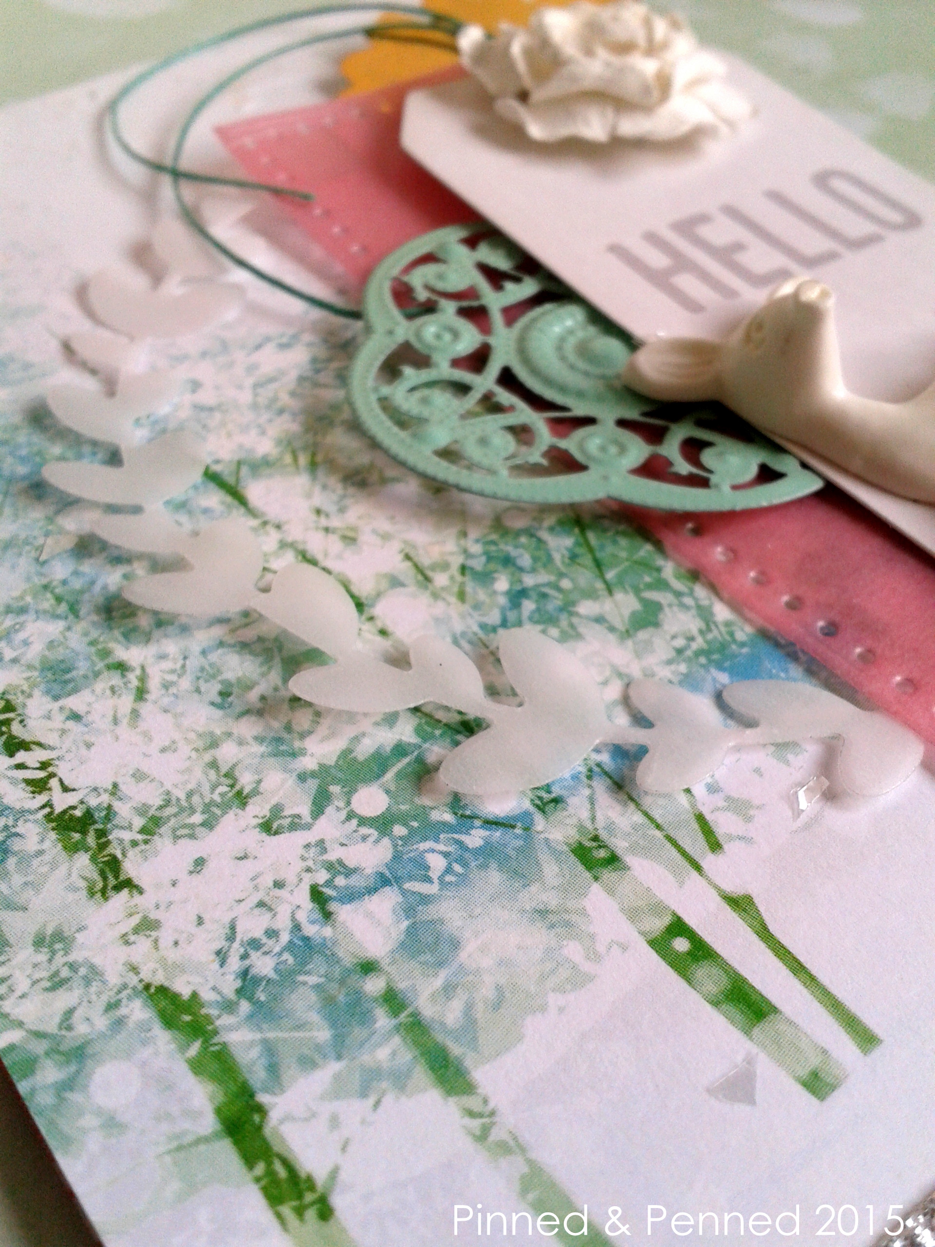
The Card Concept features cards with different styles, so mine is pretty typical of the layered, freestyle collage work I create.  I began with my little deer and Crate Paper’s Notes and Things tag, both horde-worthy, since you cannot find either anywhere!  I bought three packages of white, brown, green and orange deer, but the white are my favorite, and I am being very selective with how I use them! I also scattered some Melissa Frances vintage snow across the top of the card, which didn’t show up in the photo’s below. 2015-01-16 14.04.10 
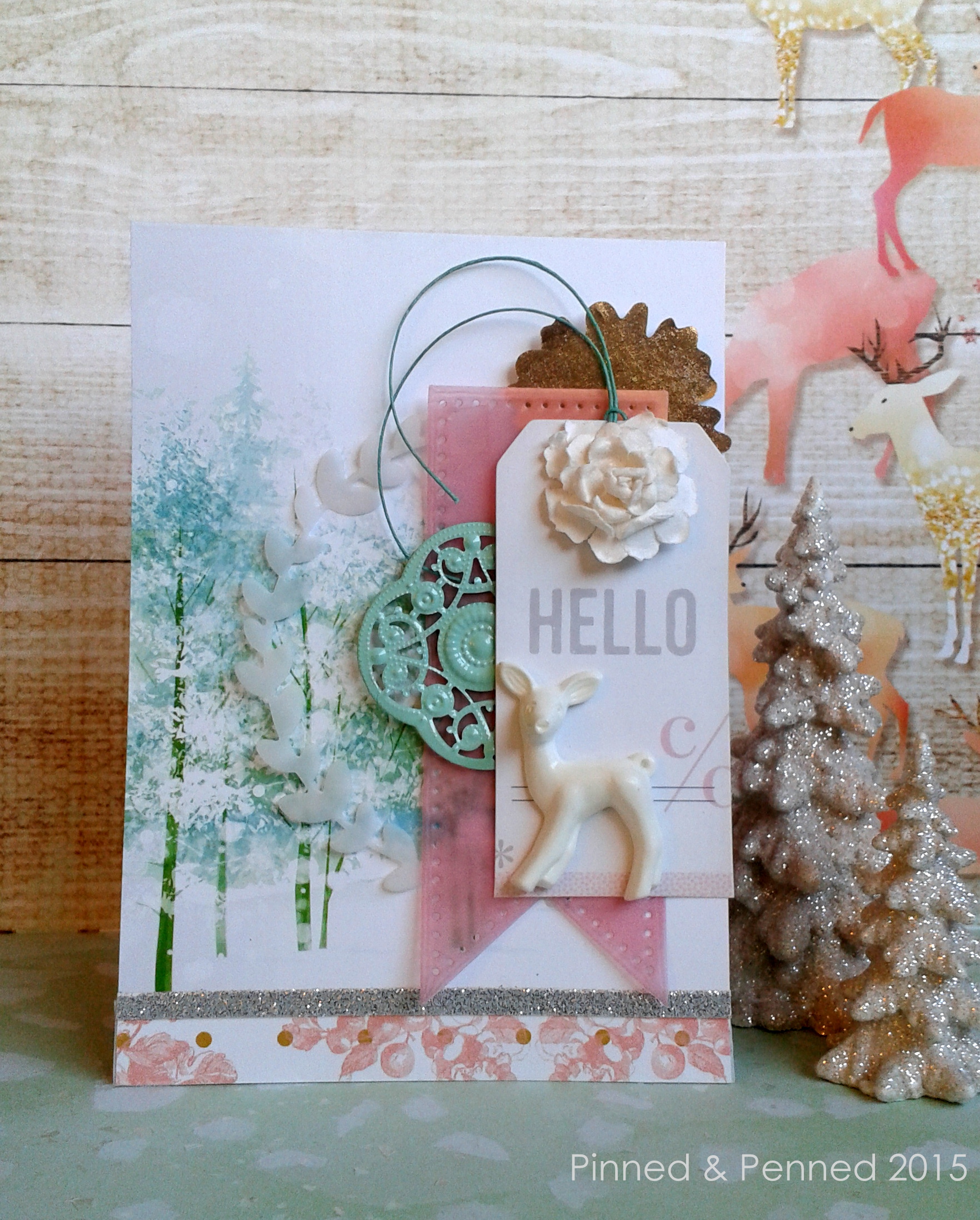
From there, I played around with layering, using vellum to keep the soft feel of the scene. 2015-01-16 14.03.19 2015-01-16 11.58.05 I wanted to use the entire paper for the card as opposed to affixing it to a base; so the back is the top of the paper, a gorgeous blue-grey with bokeh snow. 2015-01-16 12.04.54 
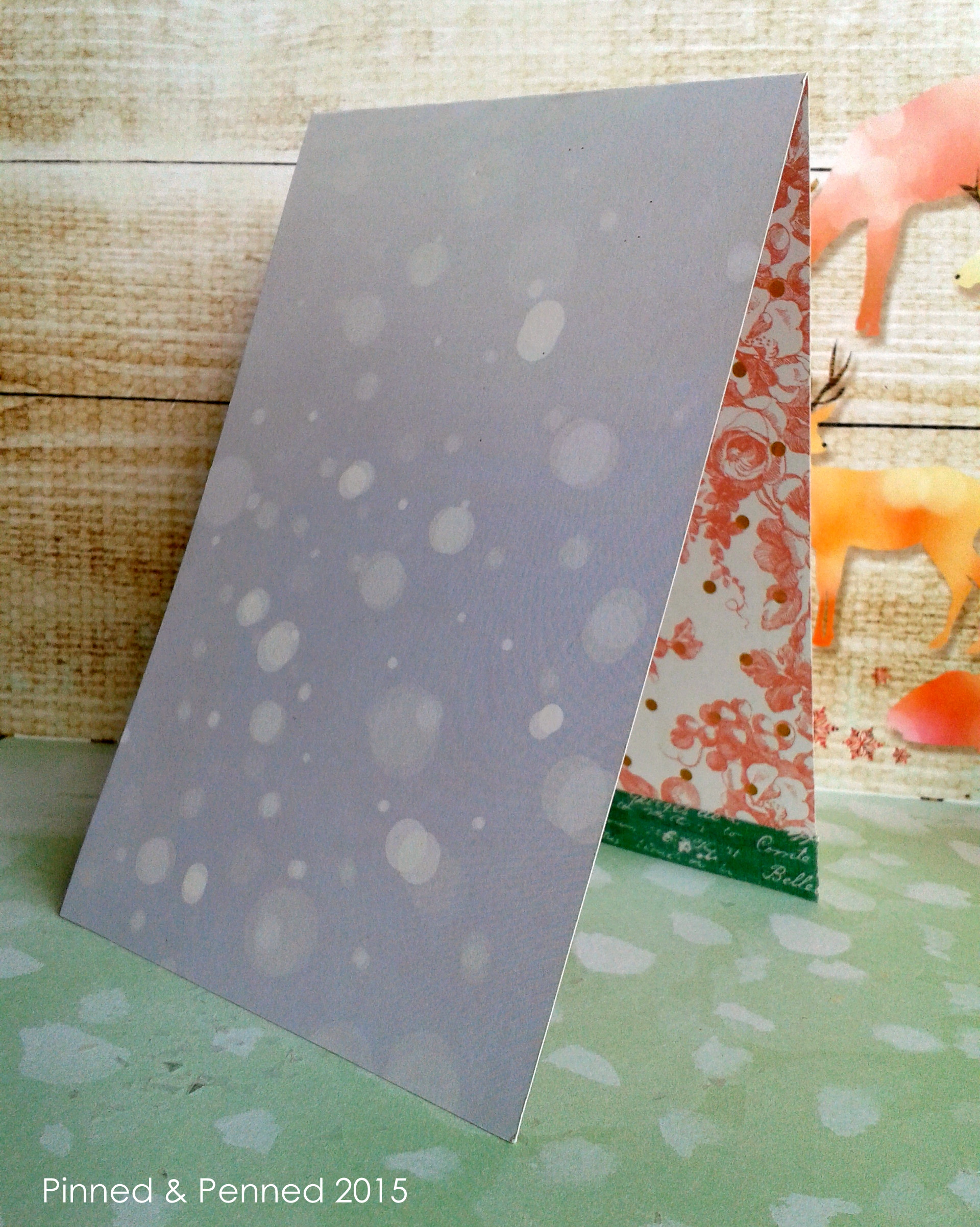
You will notice the back is about a half-inch longer than the front, as I wanted the pink floral to peek through.  Since the inside strip includes the barcode and company information, I covered with a piece of fabric washi, that isn’t quite opaque enough to hide that information!  So it will likely be replaced with another teal washi. My background staging paper is also from the Webster’s Pages collection. 2015-01-16 12.08.24

If this scene doesn’t make you want to say hello to a New Year, I don’t know what would!   I hope the first two weeks of 2015 have found you well and able to carve out some creative time, or opportunities to wonder and wander in a snow-covered field. Happy Winter!

Into the Deep

closeup2

Hello everyone!  It’s well into Thursday for some of you, and that means it’s time for another week of inspiration over at CASE Study!

I have been itching to sit down and write this post, but I have been knee-deep in work, so I didn’t get to it in time for the strike-of-midnight reveal over at CASE.

We are back with another very cool card by Joni Andaya.  This week is a move in the more modern, trendy direction.

CSC182

The minute I saw this card, back in Februrary, I knew exactly what I wanted to do, inspired not only by Joni’s technique, but also the gorgeous mercurial blue hues of the Puget Sound that lap pretty much at my back door.

I have always been drawn to bodies of water, so I am incredibly lucky to live steps from the beach.  I love watching how the Sound changes not only daily, but hourly in its depth and color.  I wanted to capture one of my favorite blues in this card.

CASE Week2 GD IMAGE

What I love about Joni’s card is how she created that wonderful focal point where the colors lighten in the center.  First thought–its like what you see when you are swimming deep, and begin to come up toward the light.

So working from the margins toward the center of the watercolor paper, first with Peacock Feathers Distress Ink, and blending back, adding Tumbled Glass and Salty Ocean Distress Stains on the outer edges, I tried to create that effect.  Because I used a combination of the Distress Ink and Stains, which are liquid, I decided to use watercolor paper.  Most techniques blend with the ink pads only; I wanted to experiment a bit using both the ink and the liquid stains on my application sponges.

After blending my blues, I tapped water with a brush along the card.  Then I spritzed Heidi Swapp’s Color Shine in white and Mr Huey’s Shine mist to give it a pearlescent effect, which you can really see in the photo below.

close up.33

2014-03-11 15.08.59

In keeping with the sea theme, I wanted to create a lot of slippery and rough textures.

For the heart and arrow, both die cut from the Lil’ Inkers set, Of the Heart, I blended alcohol inks in Watermelon and Sunset Orange onto Ranger Gloss Finish Paper.  I have been playing around with my alcohol inks quite a bit and will reveal some of them soon!

Using some of the Melissa Frances Glass Glitter in Deep Pink, which is wonderfully chunky, I adhered this with Glossy Accents onto my arrow, creating some gorgeous deep sea coral!

extreme close up9

Now for those letters!  You likely recognize them from Mama Elephant; they have appeared on a few of my cards lately.  I initially cut the negatives in my paper; then I die cut multiple letters in black cardstock, adhering 4 layers of letters.

I covered with Glossy Accents, and when dry adhered below my panel so they are just about surfacing atop the blue.  I used some gorgeous turquoise Bazzill paper for my layer underneath the panel, leaving some of it peeking out from the bottom, to play on the variant blues and add some interest and additional depth.

My little nest of silver thread was a final touch on the front, which echoes for me fishing line and the silvery streams of fish that shimmer by when you are swimming or snorkeling.  A bit of Crate Paper’s DIY Shop adhesive paper finishes off the back and inside.  The grey stripe really seemed to add an important element to this card; can’t explain it–it just worked!!

I have a few other cards with this distressing technique waiting in the wings.  So be sure to check back soon for those!

May your day go swimmingly and may you find yourself deep in delight.  If you head over to CASE Study right now to see what the rest of the design team conjured, you no doubt will!

Here are direct links to each fabulous designer if you want to blog hop!

Chupa
Amy Wanford
(Amy’s not playing this week 😦 , but get over to her blog anyway for amazing creations!)
Clare Buswell
Debby Hughes

Jeanne Jachna

Maureen Merritt

Silke Ledlow

Tasnim Ahmed

March Guest Designers: 

Sarah Gough